ActivityTracker: the Tamagotchi for sales teams
Getting ThereWeighted mean of 11 dimensions from a sourced principles library (NN/g, Baymard, Cialdini, WCAG, Core Web Vitals, Laws of UX).
The Scorecard
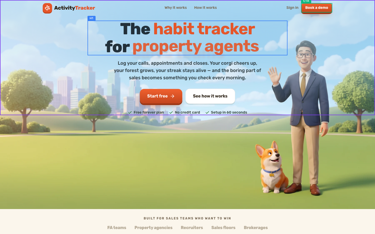
What your visitor sees first
The Brutal Truth
Your page is beautifully made and well written, and then it drops the ball at the exact moment a warm visitor tries to act. Your loudest button, 'Start free', does not start anything. When our test visitor clicked it, the page simply scrolled to another section, so the free-plan promise that anchors your whole pitch leads nowhere a new user can begin. That single broken link between desire and action leaks your highest-intent clicks straight back into the scroll. Sitting behind it is a trust ceiling: no About, no contact route beyond the demo, and testimonials whose names reappear in the sample activity feed, which tips a careful buyer that the proof is decorative. So the people most ready to try you cannot, and the skeptics find nothing verifiable to lean on. The craft earns the click. The funnel wastes it. Fix the 'Start free' destination and make one piece of proof real, and a page that currently converts on charm alone will start converting on purpose. Until then you are paying for polish you do not cash in.
Top 3 Things to Fix Right Now
First Impression & Clarity 8/10 · 14% weight
In five seconds a stranger gets it: the H1 reads 'The habit tracker for property agents' with the audience word rotating through property agents, sales teams and financial advisors, and the subline 'Log your calls, appointments and closes. Your corgi cheers up, your forest grows, your streak stays alive' says exactly what you do and what changes. That satisfies the five-second test and keeps the value proposition on the visitor's side rather than the company's. The above-fold render is warm and credible: a 3D advisor and corgi on a park backdrop, one orange 'Start free' button clearly dominant, and a secondary ghost button beside it. Differentiation is implied by the game layer and made explicit lower down ('You already do all this. It's just scattered'). Two soft spots. Your title tag sells 'the Tamagotchi for sales teams' while the on-page H1 says 'habit tracker,' so the entry-point scent and the hero pitch use different metaphors. And 'Tamagotchi' is a coined reference some FA or property buyers will stall on. Neither is fatal, but tightening message match would sharpen an already strong open.
Visual Hierarchy & Layout 8/10 · 11% weight
The composition guides the eye on purpose. Above the fold one focal chain runs H1, then subline, then the orange 'Start free' button, and the illustrated advisor's gaze and raised hand sit to the right without stealing the button's weight. Size, weight and color rank cleanly: a heavy rounded display face for the headline, medium body, and a single saturated orange reserved for the primary action. Down the full page you use cards, tinted bands (the blue 'Every activity plants a tree' and 'A world your team wants to open' sections) and a comparison table to chunk content into perceptible regions, which is textbook common-region and proximity grouping. Whitespace is generous and section rhythm is even. Two things hold it back from a 9. The blue full-bleed bands render as large near-empty color fields in the full-page capture, which reads as unused space rather than deliberate rest. And the four-up feature cards under 'Small actions. Big results.' carry a lot of small text that flattens the secondary/tertiary distinction inside each card. Neither breaks the page. The overall craft is well above template baseline.
Typography 7/10 · 7% weight
Type has personality and a clear scale. A heavy rounded display face carries the H1 and section heads ('Small actions. Big results.', 'Track it in 3 easy steps') with an obvious step down to a lighter body face, so heading, subhead and body are easy to rank. Body copy in the hero and cards looks comfortably above 16px and line height in the subline is relaxed enough to track. Emphasis leans on weight and the orange accent rather than resizing everything, which keeps the page calm. Two limits. The hero and most section intros are centered, and a couple of card descriptions run to three lines centered, which is harder to scan than left-aligned copy once a block passes two lines. The rotating audience word in the H1 also changes the line's length and balance as it cycles, so the headline never settles into one fixed shape. These are refinements, not readability failures. Nothing on the page forces a squint, the family count is restrained to two, and the scale is deliberate rather than accidental.
Color & Contrast 7/10 · 7% weight
Color is disciplined. One saturated orange is reserved for actions ('Start free', 'Book a demo') and the logo mark, so the eye finds the next step without hunting, and the rest of the palette stays in soft sky blues, greens and warm cream that feel cohesive rather than scattered. The primary CTA pops hard against both the sky hero and the cream sections, satisfying the high-contrast-CTA and reserved-action-color principles. The headline black on light blue is strong. Where it slips is the muted grey secondary text. The section intro paragraphs and card descriptions are set in a light grey on cream, and in the full-page capture several of those blocks read as washed out, close to the grey-on-color trap the rubric warns about. The 'BUILT FOR SALES TEAMS WHO WANT TO WIN' eyebrow and the tinted-band body copy are the most at risk of dropping below 4.5:1. None of it is illegible at hero size, but the smaller supporting copy would benefit from darkening toward the background hue instead of graying out.
Conversion Path & CTA 6/10 · 14% weight
The path is mostly well built but has one real leak. Above the fold you offer 'Start free' as the primary and 'See how it works' as the secondary, with risk reversal right underneath ('Free forever plan', 'No credit card', 'Setup in 60 seconds'), which is exactly the reassurance a cold visitor needs. The demo route is excellent: clicking 'Book a demo' opens a real scheduler with day tiles, open slots, timezone and a one-tap 'Grab the next slot' shortcut, so a convinced buyer can book in seconds with visible progress. The problem is the free-signup route. When our test visitor clicked 'Start free', it did not open a signup or account screen, it scrolled to another section on the same page. Same for 'See how it works'. So your headline conversion action, the free plan, currently leads nowhere a new user can actually start. That is the single biggest fix here. The CTA is repeated at the close ('Start free' / 'Book a demo'), copy is value-led and low-friction, and there is no sign-in wall. Make 'Start free' actually start the free product and this dimension jumps.
Trust & Credibility 5/10 · 12% weight
The page looks professionally made, which earns the first layer of trust: consistent craft, no broken layout, a current 2026 copyright, and privacy and terms links in the footer. Beyond design, though, a skeptical buyer finds thin evidence that a real, contactable company stands behind this. There is no About section, no company address, and no contact path other than the demo scheduler. The footer names only 'ActivityTracker' with product and legal links. The three testimonials ('My streak hit 40 days...' by Rachel T., Financial advisor) are named with roles but carry no photos, company names or links, so they read as illustrative rather than verifiable, and the activity feed and leaderboard use the same sample names, which a careful reader will notice. Big claims like 'proven habit science' and 'a pipeline that keeps filling itself' have nothing sourced behind them. None of this looks dishonest, but for a tool you would roll out to a whole sales floor, the absence of a real-org footprint and checkable proof is the ceiling on trust. Add company identity, a contact route and one real named customer and this climbs fast.
Social Proof & Persuasion 6/10 · 10% weight
Persuasion mechanics are well chosen and the audience framing is sharp. You speak directly to a named group ('property agents', 'financial advisors', 'FA teams', 'Property agencies', 'Recruiters') so the reader feels the page is for people like them, and the reciprocity of a free-forever plan gives a genuine low-commitment first yes before the demo ask. The 'What it does to a team' testimonials are specific and quotable ('The leaderboard did more for my floor than any pep talk. Reps started logging without me asking once.'), the live activity feed and 'CLUB LEADERBOARD · THIS WEEK' dramatize the social layer, and the page closes strong on 'Better habits. Better pipeline. Better results.' with a repeated CTA and reassurance, satisfying peak-end. What weakens it is authenticity of proof. The testimonials have names and roles but no faces, companies or links, and the same names (Rachel T., Marcus L., Priya N.) appear in both the testimonials and the sample activity feed, which tips a careful reader off that they are illustrative. There are no customer logos, press mentions, counts or ratings that a buyer could verify. The persuasion structure is right; the proof needs to become real.
Content & Copy 8/10 · 9% weight
The writing is the strongest part of this page. It leads with outcomes, not mechanics: 'the boring part of sales becomes something you check every morning' and 'Small actions. Big results.' put the reader's result first and use the corgi, forest and streak as proof of the mechanism underneath. It is written for skimming, with short chunked sections, descriptive subheads that carry meaning on their own ('Track it in 3 easy steps', 'You already do all this. It's just scattered.', 'See it live before you roll it out'), and a comparison block that answers the real objection, why not just keep the spreadsheet, by listing what happens 'if you remember' versus 'automatic'. Specifics land where they matter: 'Under ten seconds per activity', 'Two taps and it's in', '30 minutes, not a sales pitch'. Voice stays consistent and warm throughout, and the copy is reader-centric, framing the visitor's problem rather than bragging about the product. The only gaps are trust-adjacent, not craft: 'proven habit science' is an unbacked phrase, and there is no pricing or FAQ block to close out cost and edge-case questions a buyer will still have. As pure conversion copy this is a high performer.
Accessibility (conversion-relevant) 5/10 · 5% weight
Structural basics are in place but image and target-size gaps pull this down. The document sets html lang to English, the heading order has no skipped levels, and controls all carry accessible names, which are real wins. The scheduler reached from 'Book a demo' shows persistent visible labels ('Tuesday, July 21', 'Select a time slot to book your session', '30 min') rather than placeholder-only fields, so the form is navigable. The main problems are two. Eleven of eighteen images have no alt text, including '/welcome/scene-hero.webp' and the corgi mood art, so a screen-reader user loses the hero scene and much of the product story. On mobile, two tap targets measure only 36px tall, including 'Book a demo' at 120x36, below the comfortable 44px and under the 24px floor for spacing comfort. One more caution: the headings list shows the rotating H1 captured as more than one level-1 heading, so confirm the animated variants do not expose multiple H1s to assistive tech. Fixing alt text and bumping the header CTA height are quick wins that also help SEO and trust.
Performance & Perceived Speed 9/10 · 5% weight
This page is fast and stable. DOM content loaded in 871ms and full load in 964ms, well inside the 2.5-second good threshold for main content, and the above-fold hero renders completely in the capture with the headline, buttons, illustration and reassurance row all present, so the largest contentful paint is effectively immediate. Nothing in the evidence suggests layout jump: the above-fold view matches the settled full page, the illustrated hero is a single webp rather than a stack of late-loading widgets, and there are no interstitials or banners that would push content down as they arrive. Interaction feedback is prompt too. Every CTA our test visitor clicked responded immediately, scrolling or opening the scheduler without a stall or dead click. The only nuance is that network idle was reported a few seconds after load, consistent with the illustration-heavy art, but first render clearly beat that. For a page this visually rich, holding sub-second load is genuinely good and removes speed as any excuse for a bounce. Keep the hero art optimized as you add more scenes and this stays a strength.
Mobile Experience 7/10 · 6% weight
The mobile build is a genuine reflow, not a shrunk desktop. The hero stacks cleanly at 375px: headline, subline, a stacked 'Start free' over 'See how it works', the reassurance row, then the illustration beneath, with no horizontal overflow reported and body text large enough to read without pinch-zoom. The primary CTA is visible and sits in comfortable thumb reach mid-screen. Two issues keep this from a higher mark. The header 'Book a demo' button measures 120x36, under the 44px comfortable tap height, so the persistent top CTA is a slightly awkward target. And our capture of the first mobile viewport flagged the H1 as not fully visible on load, likely tied to the rotating headline animation changing the block height, so confirm the audience word cycles without pushing the headline out of the opening view. Content parity is good otherwise: the value prop, reassurance and CTA all survive the mobile layout. Bump the header CTA height and lock the H1 into the first viewport and mobile becomes a clear strength rather than a near-miss.
What You're Doing Well
- The hero passes the five-second test: 'The habit tracker for property agents' plus a plain-English subline about logging calls, appointments and closes tells a stranger what it is and who it is for instantly.
- The copy leads with outcomes and answers the real objection head-on, with the 'You already do all this. It's just scattered.' comparison pitting spreadsheets 'if you remember' against ActivityTracker 'automatic'.
- The demo path is excellent: 'Book a demo' opens a real scheduler with day tiles, slot counts and a one-tap next-slot shortcut, so a convinced buyer can book in seconds.
- Fast and stable load at 964ms with the full hero rendered above the fold, so speed never triggers a bounce.
- Disciplined visual craft: one reserved orange for actions, cohesive soft palette, generous whitespace and a warm illustrated hero that reads well above template baseline.
Technical & Accessibility signals
Load performance
Accessibility quick-checks (desktop)
/moods/corgi/loved.webp
/welcome/comp-growth.webp
Mobile tap targets (375x812)
Book a demo (120x36px)
Deterministic signals measured in-browser at capture time, not model output.
What your visitor actually saw

Make the changes above, then run coldeye on the new version. It reads the old and new side by side, blind, twice with the positions swapped, and tells you which one actually converts better. A score on its own drifts about half a point between runs, so the blind verdict is the part to trust.
Re-audit my page free