ActivityTracker Training Hub
StrugglingWeighted mean of 11 dimensions from a sourced principles library (NN/g, Baymard, Cialdini, WCAG, Core Web Vitals, Laws of UX).
The Scorecard
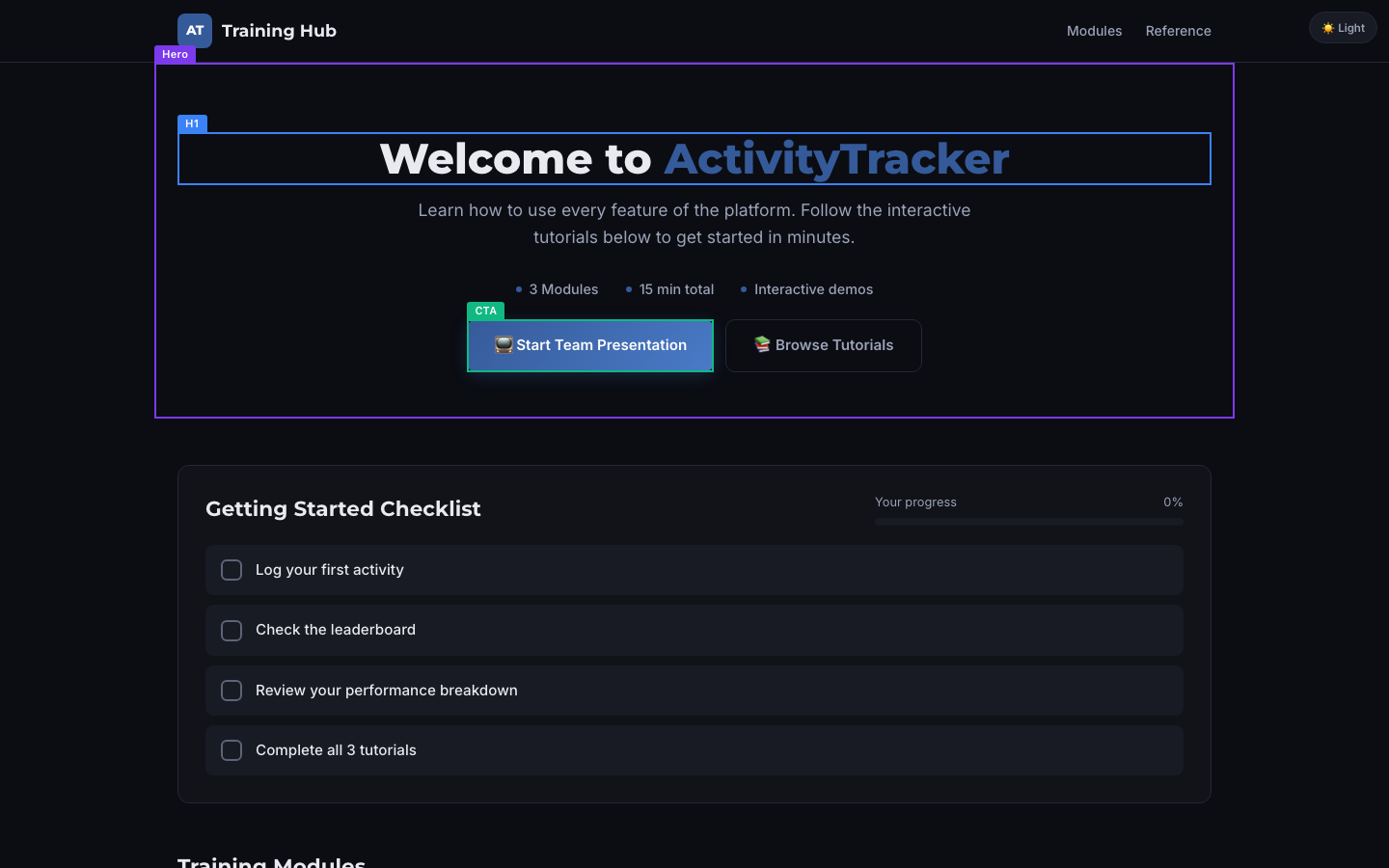
What your visitor sees first
The Brutal Truth
This is a polished internal training hub wearing the clothes of a public page, and that mismatch is why it would lose a stranger. Everything above the fold talks to someone who already works at the company: "Welcome to ActivityTracker," "Learn how to use every feature of the platform," a "Start Team Presentation" button, and a footer that says "Contact your team leader." A first-time visitor from Google cannot tell what the product does, who it is for, why it beats a spreadsheet, or who is even behind it, because the page never names an outcome, an organization, or a shred of proof that other teams chose it and succeeded. The craft is real and the funnel mechanically works, which makes the gap more frustrating, since the design quality would carry a genuine value proposition if one existed. Right now a stranger reads a confident, attractive page about a product they still cannot describe, and confident-but-unclear is exactly the combination that makes people close the tab. Give the hero a customer outcome, add an identity, and earn one piece of proof, or keep converting no one new.
Top 3 Things to Fix Right Now
First Impression & Clarity 4/10 · 14% weight
Your headline reads "Welcome to ActivityTracker" with the subline "Learn how to use every feature of the platform. Follow the interactive tutorials below to get started in minutes." That fails the 5-second test for a stranger. A first-time visitor from Google cannot tell what ActivityTracker does, who it is for, or what result it delivers, because the hero talks about learning the tool rather than the outcome the tool produces. The value proposition is company-centric, not customer-centric: "every feature of the platform" is the classic feature framing the principle warns against. Nothing on the page states why to choose this over a spreadsheet or a rival tracker, so differentiation is absent. On visual craft the page does better. The dark layout is balanced, the type is clean, and the blue primary button sits in an obvious spot, so the snap-judgment and Jakob's-Law conventions pass. But "Start Team Presentation" as the dominant action is confusing wayfinding for a solo visitor. The message-match also wobbles: the tab reads "ActivityTracker Training Hub" while the hero says "Welcome to ActivityTracker," pitching training in one place and the product in another.
Visual Hierarchy & Layout 7/10 · 11% weight
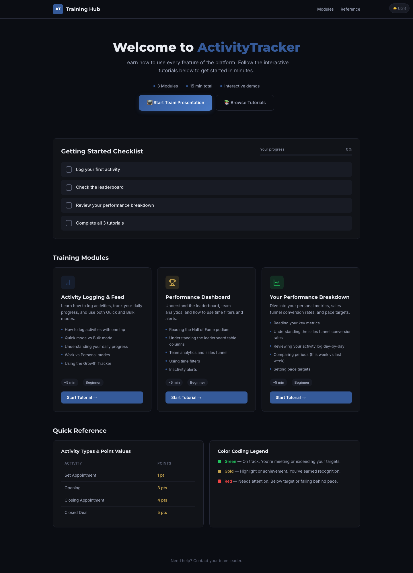
The composition guides the eye well. Your hero has one clear focal point, the large "Welcome to ActivityTracker" wordmark, and the blue "Start Team Presentation" button wins the visual-weight contest against the ghost-styled "Browse Tutorials" beside it, so Von Restorff and the dominant-focal-point principle pass. Whitespace is generous: the hero breathes, and the checklist and module cards have comfortable internal padding without crowding the viewport edges. Gestalt grouping is a real strength. The three training modules sit in matched cards with shared containers, the checklist rows are bound in one panel, and the Quick Reference splits into two clean regions, so common-region and similarity both hold. The spacing rhythm down the full page is consistent between sections. Two things hold the score back. The three "Start Tutorial" buttons repeat the same blue as the hero primary, which flattens the ranking between the page's main action and secondary in-card actions, so a visitor gets no help deciding what matters most. The metric pills ("3 Modules," "15 min total," "Interactive demos") are quiet and nearly uniform, adding a little mid-hero noise rather than a clear secondary tier. Depth is handled with subtle card elevation, which reads cleanly.
Typography 7/10 · 7% weight
Type is set with care. The scale is deliberate and limited: a heavy display weight for the hero, clear H2 section titles like "Getting Started Checklist" and "Training Modules," H3 card titles, and readable body text form obvious steps between levels, so the deliberate-type-scale principle passes. Body copy in the module cards looks comfortably above 16px and the line height gives paragraphs room to track, so lines never collide. A single sans-serif family carries the whole page, which satisfies the restrained-typeface rule. Emphasis is handled with weight and color rather than size alone: the accent-blue "ActivityTracker" in the hero and the bold point values in the reference table stand out without resizing everything. Two smaller issues cost a point. The hero headline and subline are centered, which is fine for a short hero, but the same centered treatment on the two-line subline slightly slows reading versus left alignment. Inside the cards the body is correctly left-aligned and the measure stays controlled, so long-form reading is comfortable. The muted grey used for secondary lines like the metric pills and "~5 min" runs light against the dark background, which nudges toward the low-contrast edge for the smallest text.
Color & Contrast 7/10 · 7% weight
Color is disciplined. The palette is a cohesive dark theme built on near-black surfaces, white and grey text, and a single blue reserved for action, so the cohesive-palette and one-reserved-action-color principles largely hold. The primary "Start Team Presentation" button pops in saturated blue against the dark hero and is the most eye-catching control in view, satisfying CTA prominence. White headline text on the near-black background clears the 4.5:1 body-contrast bar comfortably. The color-coding legend pairs each state with a word ("Green, On track," "Gold, Highlight," "Red, Needs attention"), so meaning is not carried by hue alone, which passes the not-color-alone rule. Two weaknesses keep this from a higher mark. The blue action color is not fully reserved: the three in-card "Start Tutorial →" buttons and the accent word in the hero all reuse it, so the eye no longer has a single unambiguous action signal. And the muted grey secondary text, the metric pills, "Your progress," and "~5 min," drifts toward the grey-on-dark contrast trap, running faint enough that a hurried reader skips it. The outline "Browse Tutorials" button has a low-contrast border that is easy to lose against the background.
Conversion Path & CTA 5/10 · 14% weight
The path works mechanically, which is the good news. When our test visitor clicked "Start Team Presentation," it opened a real 11-slide walkthrough at /presentation.html that continues the intent, so there is no dead end, no error, and no "Welcome back" login wall trapping a newcomer. The no-sign-in-wall and destination-match principles pass, and clicks registered promptly. The primary action also repeats at natural decision points, since each of the three module cards ends in a "Start Tutorial →" button, so a reader never has to scroll back. Where it loses conversions is choice and friction framing. Above the fold two actions sit side by side, "Start Team Presentation" and "Browse Tutorials," without a clear single primary, which splits intent. The label "Start Team Presentation" is odd for an individual visitor and does not express personal value; it reads like an instruction for a manager presenting to a room. There is no risk-reversal or next-step reassurance anywhere near the action, and with no pricing on the page the visitor cannot judge cost or commitment. For its actual job, internal onboarding, this is serviceable. As a page that must move a stranger to act, the value-led CTA copy and single-primary discipline are missing.
Trust & Credibility 3/10 · 12% weight
A stranger has almost nothing here to believe in. The footer says only "Need help? Contact your team leader," so there is no company name, no physical address, no About section, and no way to reach a real organization. The real-organization-identity and easy-to-contact principles both fail outright, and pointing a first-time visitor to "your team leader" assumes they already belong to a company using this tool. No privacy policy or terms link appears, and no expertise or credential signal, team, certifications, or authoritative depth, exists anywhere on the page, so the expertise principle fails too. Claims are unsupported: "Learn how to use every feature of the platform" and the funnel and target language ride on no evidence a visitor could check. What saves the score from the floor is execution. The page is genuinely well made, clean dark theme, consistent cards, aligned grid, no typos, no broken images, and no aggressive popups or ad clutter, so the professional-craft, error-free, and promotional-restraint principles pass. The site runs on HTTPS. But polish alone does not tell a stranger who is behind this product or why to trust it with a workflow, and for a page meant to explain the product that anonymity is the core credibility gap.
Social Proof & Persuasion 2/10 · 10% weight
There is no persuasion scaffolding here. The page carries no testimonials, no customer count, no recognizable logos, and no ratings, so the specific-social-proof principle fails despite the automated scan flagging a testimonial; nothing in the visible content is one. No authority marker appears either, no press mention, certification, award, or notable customer, so a stranger gets no external reason to believe. The audience is only loosely addressed. The copy speaks to whoever lands, and while the reference table hints at a sales team ("Set Appointment," "Closed Deal"), the hero never names that reader or mirrors their world, so the liking and shared-identity principles go largely unmet. The one genuine strength is reciprocity: the page gives real value up front through three free interactive tutorials and an 11-slide walkthrough before asking anything, and that free tour is also a low-commitment first yes, so the give-first and micro-commitment principles pass. The close is weak. The page ends on "Need help? Contact your team leader" rather than a confident restatement of value and a final action, so the peak-end principle misses. For a stranger weighing whether this tool is credible and worth adopting, the absence of any proof that other teams chose it and succeeded is the biggest persuasion hole.
Content & Copy 5/10 · 9% weight
The writing is clean and scannable but points inward. Structure is a strength: the page chunks into descriptive subheads ("Getting Started Checklist," "Training Modules," "Quick Reference"), each module card front-loads a bold title and a short bulleted list, and paragraphs stay short, so the scannable-structure and meaningful-subheads principles pass and a skimmer can navigate. Tone stays consistent throughout. The core weakness is that the copy is reader-distant at the top. The hero opens with "Welcome to ActivityTracker" and "Learn how to use every feature of the platform," which describes the product and the act of learning it rather than what the visitor gains, so the benefit-led and reader-centric principles both miss at the most important moment. "Every feature of the platform" is a vague claim standing in for a concrete outcome, and "get started in minutes" is a soft intensifier. Language is mostly plain, though a cold visitor may stall on unexplained internal terms like "Growth Tracker," "Hall of Fame podium," and "sales funnel conversion rates" that assume familiarity. Buyer objections go unanswered because the page never addresses cost, fit, comparison, or proof. Inside the cards the copy improves, naming specifics like "Quick mode vs Bulk mode" and the point values, which is where the writing earns its keep.
Accessibility (conversion-relevant) 6/10 · 5% weight
The structural accessibility basics are mostly sound. The page has exactly one H1 ("Welcome to ActivityTracker") and a heading order that steps H1 to H2 to H3 without skipping levels, and the headings are descriptive, so the logical-heading-structure principle passes. Link and button text is largely meaningful: "Start Tutorial →", "Browse Tutorials," and "Modules" make sense out of context, satisfying the descriptive-text principle, though the leading emoji on "Start Team Presentation" and "Browse Tutorials" add noise a screen reader will announce. Text is legible and appears to scale, with body copy comfortably sized and no evidence of tiny fixed type, so the resizable-text principle holds. Target size on mobile looks adequate: the primary button is a full-width, tall tap target with room around it. What cannot be confirmed from the evidence is the interactive detail. There is no keyboard-focus probe wired here, so the visible-focus principle is not-assessed rather than passed, and image alt text and any form labels behind the walkthrough could not be verified from the DOM. The page has no visible form on the landing view, so labeled-input risk is low at the entry point. Nothing observed actively breaks accessibility, but the unverified focus and alt-text items keep this from scoring higher.
Performance & Perceived Speed 8/10 · 5% weight
Speed is a genuine strength. From navigation start to network idle the load took roughly one second (the log shows the start at 15:01:27.4 and idle reached at 15:01:28.5), well under the 2.5-second good threshold for main-content render, and the above-fold hero appears fully rendered in the capture with no blank or placeholder state. That satisfies the fast-LCP and good-perceived-performance principles. Interactions were responsive: every CTA click in the test registered promptly and produced a result, the primary button navigated cleanly to the walkthrough, and "Browse Tutorials" scrolled to the modules section without stalling, so the INP-responsiveness and Doherty-feedback principles pass. The hero is text and a small wordmark rather than heavy media, so nothing gates first paint, which meets the lightweight-hero-assets principle. Visual stability looks good too, with the above-fold capture matching the settled page and no sign of late-loading banners shoving content, so layout shift appears low. The one soft spot is the theme toggle: clicking "Light" produced no visible change in the test capture, which suggests either a slow or missed repaint on that control, though the page itself did not break. Overall the page feels fast and attentive, which supports rather than costs conversion.
Mobile Experience 8/10 · 6% weight
The phone experience is well handled. The mobile capture shows no sideways scrolling and the viewport check confirms no horizontal overflow, so the no-overflow principle passes cleanly. Both the headline and a primary action are visible in the first mobile viewport: "Welcome to ActivityTracker" sits at the top and the blue "Start Team Presentation" button appears without scrolling, meeting the value-prop-and-CTA-visible principle. The layout is a true reflow rather than a shrunken desktop page. The hero stacks, the subline wraps to a comfortable measure, the two buttons stack vertically at full width, and the checklist reflows so each row shows its label and a tutorial link, which satisfies the responsive-reflow principle. Tap targets are comfortable: the primary button is a tall, full-width target with clear spacing from the secondary outline button, so a thumb hits it easily. Body text stays legible without pinch-zoom. Content parity holds too, since the same value framing, modules, and reference material carry over rather than being stripped on mobile. The main limitation is inherited from the desktop page rather than the responsive work: the primary action sits high on the screen with no repeated or sticky action lower in the thumb zone, so on a long scroll a convinced visitor has no nearby button to tap.
What You're Doing Well
- The design is genuinely well built: a clean dark theme, consistent card containers, generous whitespace, and a disciplined type scale that reads as deliberate rather than templated.
- The primary CTA works and leads somewhere real. Clicking "Start Team Presentation" opened a functioning 11-slide walkthrough with no login wall, dead button, or error for a first-time visitor.
- The page is fast and stable, reaching network idle in about a second with the hero fully rendered and every tested click responding promptly.
- Mobile is a true reflow with no horizontal overflow, full-width stacked buttons, and the headline and CTA both visible in the first viewport.
What your visitor actually saw
Make the changes above, then run coldeye on the new version. It reads the old and new side by side, blind, twice with the positions swapped, and tells you which one actually converts better. A score on its own drifts about half a point between runs, so the blind verdict is the part to trust.
Re-audit my page free