CMFAS Prep, Realistic CMFAS Mock Exams & Practice Questions
StrongWeighted mean of 11 dimensions from a sourced principles library (NN/g, Baymard, Cialdini, WCAG, Core Web Vitals, Laws of UX).
The Scorecard
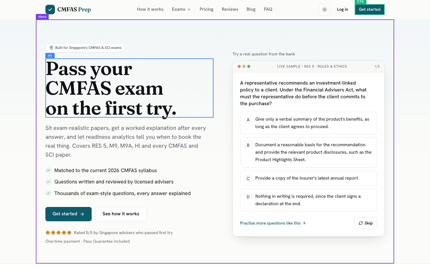
What your visitor sees first
The Brutal Truth
This page is in the top tier of what we grade, so the thing costing you customers is not the design, the clarity, or the funnel. It is a handful of small, checkable lies in your proof. A licensed adviser is a detail person by trade, and when they read 'Best $39 I've spent' next to plans priced at S$29.90 and S$79.90, or see a testimonial passing exams called CM-EIP and CM-SIP that appear nowhere in your own list of nine papers, the exact skepticism that makes them good at their job turns on your testimonials. One inconsistency they catch makes them re-read every other quote as possibly invented, and the bank logo strip that implies endorsement while your footer disclaims all affiliation deepens that doubt. You built a page good enough to earn trust on sight, then handed the careful buyer a reason to withhold it at the moment of proof. Fix the quotes to match reality and this converts like the premium product it looks like.
Top 3 Things to Fix Right Now
First Impression & Clarity 9/10 · 14% weight
Within five seconds a stranger knows exactly what this is and who it is for. The H1 'Pass your CMFAS exam on the first try.' names the outcome, and the subline delivers the mechanism and coverage in one read: 'Sit exam-realistic papers, get a worked explanation after every answer, and let readiness analytics tell you when to book the real thing.' The badge 'Built for Singapore's CMFAS & SCI exams' pins the audience. Clarity, customer-centric framing, and jargon-fit all pass. The acronyms RES 5, M9, M9A are the audience's own vocabulary, so they read as precision, not jargon, to a licensed adviser. Visual craft is high: a confident serif display face, a live sample question card on the right that shows the product instead of describing it, a green-check benefit list, and a reserved teal CTA. One dominant claim leads, the primary action sits above the fold on both desktop and mobile, and title-to-hero message match holds. The only reason this is not a 10 is the 5/5 rating carries no count next to it. This is a page a buyer trusts on sight.
Visual Hierarchy & Layout 8/10 · 11% weight
The composition guides the eye on purpose. Above the fold the headline wins the weight contest, and the sample card acts as a second focal point that pulls the reader into the product rather than away from it. Down the page, content is chaptered into cards and background bands: three benefit cards, a recommendation-engine block with a mock UI, a comparison table, exam cards in a grid, and pricing cards with a raised 'Most Popular' plan. Proximity and common-region grouping both pass because labels sit with their content and every section is bounded. Similarity holds too, since primary actions share the same teal button style throughout. Whitespace is generous and the spacing rhythm is consistent between sections. Two things keep this off a 9. The stat row ('5,600+ exam-style questions, 9 papers, 6 modes, 100% explained') is visually quiet and easy to skate past for numbers that should carry weight. The feature-card icons are small and low-contrast, so the three benefit blocks under the hero read as near-uniform grey text with little ranking between title and body.
Typography 8/10 · 7% weight
Type is set with intent. A high-contrast serif display face carries the H1 and section headers, paired with a clean sans for body and UI, and the two roles never blur. Hierarchy is clear: the headline is large and dark, the subline steps down in a muted grey, and body copy sits at a comfortable reading size with adequate line-height in the paragraph blocks. Emphasis comes from weight and color rather than from resizing everything, and secondary text is de-emphasized in grey without dropping below legibility on the white ground. Body copy is left-aligned in the content sections. Two soft marks keep this from a 9. The pricing and section intros are centered across a wide measure, so lines like the pricing subhead run long and lose the ideal 45 to 75 character measure on desktop. The hero subline is set in a light grey that, while readable, is the lightest the page should go. Overall the type personality is deliberate and reads as designed, not defaulted.
Color & Contrast 8/10 · 7% weight
Color is disciplined and cohesive. A single deep teal is reserved for the primary action, so the eye finds 'Get started' and 'Get the bundle' automatically, while everything else stays neutral on near-white and soft grey grounds. The palette is harmonious, with green check icons and amber rating stars as the only supporting accents, and there is no color zoo. The primary CTA contrasts strongly against its surroundings and is the most eye-catching control on the page. Meaning is not carried by color alone, since benefits pair a check icon with text and links carry an arrow glyph. Two things hold this at 8. The hero subline and several secondary lines sit in a light grey that is legible but close to the floor for smaller text on white, so a stricter contrast pass would flag them. The secondary buttons ('See how it works', 'Choose this plan') are outline-only, which is the right hierarchy choice but leaves them low-contrast enough that on the pricing page the ghost 'Choose this plan' reads quieter than the situation wants. The reserved action color is the standout strength here.
Conversion Path & CTA 8/10 · 14% weight
A convinced visitor can act with little friction. One primary action, 'Get started', leads the hero, with 'See how it works' correctly demoted to an outline button. When our test visitor clicked 'Get started', it went straight to the pricing page and landed on 'Choose your success path' with three clearly priced plans, so the promise and the destination line up. No sign-in wall traps a new user, and there is no dead end or error. Risk reversal is genuinely strong: every plan carries a Pass Guarantee stated on the page, one-time payment with no subscription is repeated at each price, and the guarantee has concrete steps rather than fine print. The primary action recurs at natural decision points and closes the page with 'See plans & pricing'. The live sample question offers a real low-commitment first yes before any payment. Two things keep this at 8. 'Get started' is slightly generic for a page whose real entry is trying a question or picking an exam, and it commits the visitor to a pricing decision faster than the softer 'try a question' path implies. Pricing is clear and honest, which removes the biggest friction point most sites leave in.
Trust & Credibility 7/10 · 12% weight
A stranger has real reasons to believe this site, with a few cracks that a careful buyer will notice. The footer names the company, gives a Singapore location and a UEN line, links Terms and Privacy, shows a 2026 copyright, and offers a support address on the site's own domain rather than a free-mail account. The Pass Guarantee, the current-syllabus promise, and a licensed-adviser authorship claim all build credibility, and the design craft itself earns trust before a word is read. Two things cost points. The testimonials contain internal mismatches: 'Best $39 I've spent' names a price that matches none of the plans (S$29.90, 49.90, 79.90, 89.90), and 'Rachel G. Passed CM-EIP & CM-SIP' cites exams that do not appear anywhere in the product's own list of nine papers. A skeptical reader who spots either starts doubting the rest. The logo strip 'Trusted by advisers at Singapore's leading financial institutions' shows bank marks that imply endorsement, while the footer states the product is 'Unaffiliated with SCI, IBF or any examining body'. Tightening these would move this dimension to an 8 or 9.
Social Proof & Persuasion 8/10 · 10% weight
The page persuades with specific, mostly credible proof. Six testimonials carry names and context ('Ethan L., Financial Adviser, Great Eastern', 'Bryan T., Passed M9'), which is far stronger than the vague 'trusted by thousands' most sites settle for. The 5/5 rating, the bank logo strip, and named institutions supply authority. Reciprocity and a low-commitment first yes both land through the live sample question and 'Free mock questions', so the visitor gets value before paying. Liking is strong because the copy speaks the exact language of a Singapore financial adviser, and the Pass Guarantee reads as a shared-stakes promise ('we would rather earn your result than your refund request'). The close is genuinely a peak-end: 'Walk into your exam already knowing you'll pass.' with a final CTA. Two things keep this at 8. The proof authenticity is undercut by the same testimonial mismatches noted under trust (a $39 price and CM-EIP/CM-SIP exams that do not exist on the page), which is exactly the kind of detail that makes a skeptic wonder if the quotes are real. Honest scarcity is absent, which is fine here since faking it would be worse.
Content & Copy 8/10 · 9% weight
The writing is benefit-led, scannable, and reader-centric. Section headers carry the point on their own: 'Practice that targets your weak chapters', 'A mock that feels like the real paper', 'Prepare with us and pass, or study free until you do.' Copy speaks to the visitor's outcome ('You spend your time where it moves your score') rather than the company's story, and each feature block leads with what changes for the reader before listing the mechanism. Skimmability is good, with short paragraphs, check-marked lists, a comparison table, and a nine-question FAQ that pre-empts the real objections: how it differs from books, whether content is current, who writes the questions, how the guarantee works, and whether it is a subscription. Plain language holds for the audience, and the exam acronyms are the reader's own terms. Two small marks. A few section intros lean on soft phrasing ('the smart way', 'Prepare with us') where a concrete number would hit harder. The stat block that should quantify the offer ('5,600+ questions', '9 papers') is written but rendered so quietly it barely counts as copy. This is well above the category norm.
Accessibility (conversion-relevant) 7/10 · 5% weight
The conversion-relevant essentials mostly hold, judged from structure and screenshots since no deterministic accessibility probe was captured this run. The heading order is sound: exactly one H1, then H2 section headers with nested H3s for feature and exam cards, and the text is descriptive rather than generic. Links and buttons read well out of context ('See how it works', 'Practise this exam', 'View all 9 exams', 'See plans & pricing') with no 'click here' or bare-icon actions. A light and dark theme toggle sits in the header, which helps readable-text preferences. Tap targets on mobile look comfortably sized, and body text is legible without zoom. Two caveats keep this at 7. The muted grey used for the hero subline and secondary lines sits near the small-text contrast floor, which is an accessibility concern as much as a design one. Focus-visible styling, alt text on the logo strip and mock-UI images, and true contrast ratios could not be verified because the technical and accessibility signals came back empty for this capture, so those are noted as not-assessed rather than passed.
Performance & Perceived Speed 7/10 · 5% weight
No real Core Web Vitals were captured this run, so this is judged from load timing and the render evidence. The navigation log shows the DOM ready quickly and network idle reached about six seconds after navigation start, hitting the settled state within the cap rather than timing out. The above-fold capture shows the hero and the interactive sample card fully rendered, so the largest content paints as real content, not a placeholder. All three tested CTA clicks registered promptly and produced a clean navigation, which is a good proxy for responsive interactions and prompt feedback. Two things temper the score. The animated count-up stats were caught mid-animation during extraction, reading '0+' and '0%' in the underlying content while the settled screenshot shows '5,600+' and '100%', which hints the numbers depend on a scroll-triggered script that could show zeros to a fast-scrolling or reduced-motion visitor. The roughly six-second gap to network idle suggests some assets keep loading after first paint. Without a measured LCP and CLS this is a cautious 7 rather than a confident pass.
Mobile Experience 9/10 · 6% weight
The phone experience is genuinely built for mobile, not shrunk down to it. The viewport check reports no horizontal overflow, and the mobile capture confirms it: the layout reflows to a single column with the badge, the large serif headline, the subline, the three-item benefit list, and a full-width 'Get started' button all stacked cleanly. Both the value proposition and a primary CTA are visible in the first mobile viewport. The primary button spans nearly the full width, which makes a comfortable thumb target, and body text stays legible without pinch-zoom. The header collapses to a logo, a theme toggle, and a hamburger, which is the convention users expect. This is true responsive reflow rather than a scaled desktop page. The only reason this is not a perfect 10 is the primary action sits toward the middle of the first screen rather than pinned in the lower thumb zone, and a sticky bottom CTA on scroll would keep the action in reach through the long page. Content parity holds, since the persuasive case and CTA both survive the move to mobile.
What You're Doing Well
- The hero passes the five-second test cleanly: 'Pass your CMFAS exam on the first try.' names the outcome, and the subline delivers the mechanism and the full exam coverage in one read.
- A live, interactive RES 5 sample question sits above the fold and shows the product working instead of describing it, which doubles as a low-commitment first step before any payment.
- Risk reversal is real and on the page, not in fine print: every plan repeats one-time payment with a Pass Guarantee, and the guarantee spells out three concrete steps to a free extra month.
- The design is genuinely crafted, with a confident serif display face, a disciplined single teal action color, generous whitespace, and card-based grouping that reads as intentional, not templated.
- Pricing is upfront and honest with three clearly framed plans, and clicking the primary CTA lands the visitor on that pricing page with matching messaging, so the path forward is never hidden.
- The mobile experience is a true reflow with no horizontal overflow, headline and CTA in the first viewport, and comfortable full-width tap targets.
What your visitor actually saw

Make the changes above, then run coldeye on the new version. It reads the old and new side by side, blind, twice with the positions swapped, and tells you which one actually converts better. A score on its own drifts about half a point between runs, so the blind verdict is the part to trust.
Re-audit my page free