FINternship, Mentor-led apprenticeship in Singapore
StrongWeighted mean of 11 dimensions from a sourced principles library (NN/g, Baymard, Cialdini, WCAG, Core Web Vitals, Laws of UX).
The Scorecard
What your visitor sees first
The Brutal Truth
This is a well-built page that under-proves itself. The design, the copy, and the funnel are all above the bar for its category, so the thing standing between a curious student and an application is not confusion, it is belief. A first-time visitor is being asked to hand practical career and finance guidance, and their personal details, to an organization that shows no contactable identity, no privacy or terms page, no named mentors on the landing page, and no outside authority such as a partner logo, a press mention, or an institution affiliation. The testimonials are three initial-badge quotes about feelings, not checkable outcomes. For a free program that hoped to remove friction, that free-ness paradoxically raises the "is this legit and worth my time" question, and the page answers it with polish rather than evidence. Fix the proof and legitimacy layer, show the real people and partners behind it, and give the strong headline a sharper who-it-is-for, and this page converts noticeably better. Leave it as trust-by-design-alone, and qualified applicants quietly bounce to something that looks more accountable.
Top 3 Things to Fix Right Now
First Impression & Clarity 8/10 · 14% weight
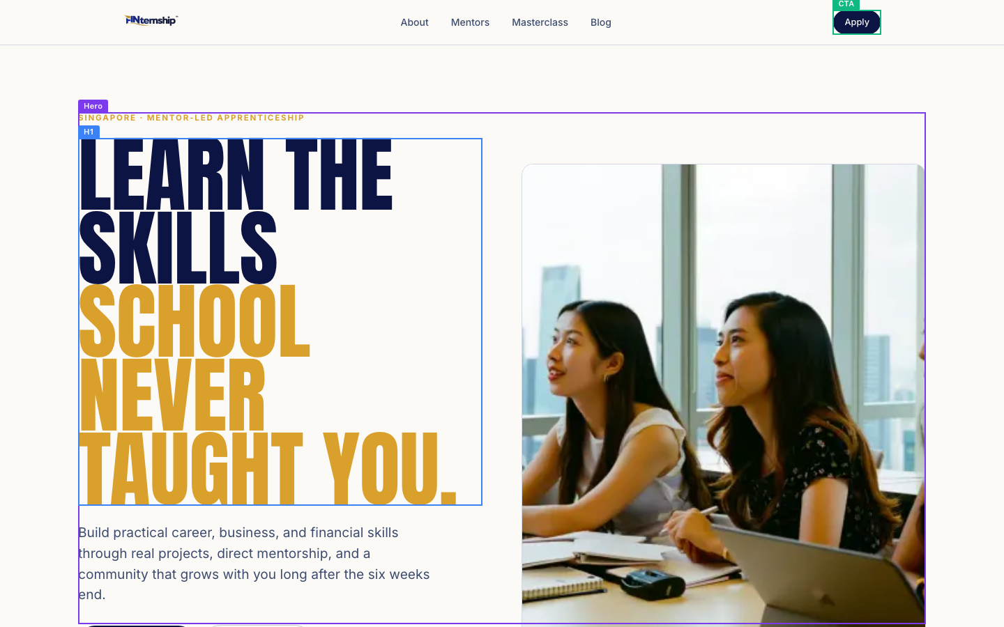
The first five seconds land well. The condensed navy-and-gold headline "LEARN THE SKILLS SCHOOL NEVER TAUGHT YOU." is bold and legible, and the gold kicker "SINGAPORE · MENTOR-LED APPRENTICESHIP" tells a stranger where this is and what kind of thing it is before they read a word. The subline names the payoff plainly: "Build practical career, business, and financial skills through real projects, direct mentorship, and a community that grows with you." The "Apply Now" button sits above the fold with a real photo beside it, and the trust bar ("1,000+ students mentored", "Free 6-week apprenticeship") reinforces the offer instantly. The clarity-five-second-test mostly passes because the badge plus subline carry the audience and outcome. Where it slips is single-claim-per-moment and headline specificity: "the skills school never taught you" is a trope that could headline a course, a book, or a newsletter, so the H1 alone does not say who it is for or that it is a finance apprenticeship. The photo and mission-y line rescue it, but the sharpest version would put the audience in the headline itself.
Visual Hierarchy & Layout 8/10 · 11% weight
This page has a real point of view about hierarchy. The oversized condensed headline is the unambiguous focal point in each section, so the eye lands where it should (dominant-focal-point, Von Restorff). Size, weight, and color do the ranking work: giant navy/gold headlines, mid-weight gold small-caps kickers like "WHAT YOU GET" and "WHY WE BUILT IT", then quiet body text. Whitespace is generous, with sections breathing on the cream ground and never crowding the viewport edges. Grouping is handled with common-region cards and dark navy bands ("WHY WE BUILT FINTERNSHIP", "THE GROUNDWORK BEFORE THE CREDENTIALS") that chapter the long page cleanly instead of leaving one flat sheet. The four "WHAT YOU GET" tiles and the six finance-core cards show consistent similarity styling. Alignment holds to a left-edge grid down the full page. The one honest weakness is depth: most cards are near-flat fills with little elevation or shadow, so figure-ground separation leans entirely on the background color change rather than layering. That is a minor craft note on an otherwise disciplined composition, not a conversion problem.
Typography 8/10 · 7% weight
Type is the strongest craft signal on this page. A heavy condensed grotesque carries every headline and gives the brand a distinct personality, paired with a clean humanist sans for body and labels, so there are two families with clear role separation and no clash. The scale is deliberate: a very large display size, a mid gold small-caps kicker, and a comfortable body around 16px, with obvious steps between them. Body copy is left-aligned throughout, and the hero subline "Build practical career, business, and financial skills..." sits at a readable measure rather than running edge to edge. Line height on the subline and body paragraphs looks close to 1.5 with distinct, trackable lines. Emphasis comes from weight and the navy/gold color split rather than resizing everything. The one thing to watch is the all-caps condensed headlines set very tight: on the mobile capture "LEARN THE SKILLS SCHOOL NEVER TAUGHT YOU." stacks into dense letter-packed rows that trade a little readability for impact. It works at hero scale, but the same treatment on longer lines would strain.
Color & Contrast 8/10 · 7% weight
The palette is cohesive and disciplined: deep navy, a single warm gold accent, and an off-white ground, used the same way everywhere. That restraint is exactly what cohesive-limited-palette asks for. The primary CTA is a solid navy pill that pops strongly against the cream background, so the next step is easy to find (cta-contrast-prominence passes). Navy body and headline text on cream clears the 4.5:1 bar comfortably. Gold is reserved mostly for large display type and small-caps kickers, where the 3:1 large-text threshold applies and is met. Two things to check. The gold kicker "SINGAPORE · MENTOR-LED APPRENTICESHIP" is small-caps gold on cream, and gold-on-cream at small sizes runs close to the 4.5:1 line, so it risks the grey-on-color-style low-contrast trap for the smallest label text. On the dark navy bands, the body text is a light tint that reads fine, avoiding the muted-grey-on-dark trap. Overall this is a controlled, legible color system with one small-text gold label worth verifying.
Conversion Path & CTA 8/10 · 14% weight
The path from convinced to acted-on is clean. There is one dominant action, "Apply Now", styled as a navy pill, with "Read the blog" clearly demoted as a ghost button, so choice is not split. When our test visitor clicked the primary CTA, it went straight to /apply, an application page that opens "APPLY FOR THE NEXT COHORT." and continues the intent exactly, no login wall, no dead end, no error (cta-destination-message-match and no-signin-wall both pass). Friction is genuinely low: the program is free, stated up front as "Free 6-week apprenticeship", and the apply page carries real risk reversal in "10 minutes · Every submission reviewed manually", which tells the visitor the time cost and that a human reads it. The primary action repeats at the page's close under "BUILD SKILLS THAT CONTINUE PAYING OFF YEARS LATER.", so a convinced reader never scrolls back. Two soft spots: the CTA copy "Apply Now" is a commitment verb rather than a value-led, low-friction phrase, and the actual form length is not visible, so field count cannot be confirmed. Neither undermines what is a well-built funnel.
Trust & Credibility 6/10 · 12% weight
Design does a lot of trust work here. The page looks professionally built, reads without typos, and carries three named testimonials and a "1,000+ students mentored" figure, all of which help a stranger take it seriously (professional-visual-craft passes). The 2026 copyright and current cohort framing signal a maintained, live site. Where it falls short is the harder identity evidence a cautious applicant to a finance program wants. The footer names FINternship and links About and Mentors, but there is no physical address, no contact email or phone, and no privacy policy or terms link anywhere in the captured content, which weakens both real-organization-identity and security-legitimacy-signals. For a program touching "how the financial world actually works" and collecting applications from students and NSFs, the absence of a contactable entity and any legal footer is a real hesitation point. Expertise is asserted ("Founder-led mentorship", "experienced operators") but not shown on the landing page with named people or credentials, so demonstrated-expertise rests on a claim the visitor must take on faith. The bones are trustworthy; the paperwork of legitimacy is missing.
Social Proof & Persuasion 7/10 · 10% weight
The persuasion is thoughtful and mostly ethical. Three testimonials carry names and affiliations ("Jun Xi, SMU Student", "Gabriel Kow, NSF · Post-ORD", "Kenny Soh, NTU Student"), which is specific social proof rather than an anonymous boast, and "1,000+ students mentored" adds a plausible count. The "HONEST FIT CHECK" with "NOT FOR YOU IF" and "GOOD FIT IF" is a strong commitment-and-consistency move that also builds liking by respecting the reader's time. Reciprocity is real: the program is free and a full blog of "honest articles on the things school does not teach well" gives value before any ask. Liking and unity land through language aimed squarely at "students, NSFs, career switchers, and future founders" in Singapore, so the audience feels seen. The page closes on a peak with "BUILD SKILLS THAT CONTINUE PAYING OFF YEARS LATER." and a final CTA. What is missing is authority: there are no press mentions, partner or university logos, awards, or named-expert endorsements anywhere. The testimonials also use only initial-avatars (JX, GK, KS), which reads a notch less credible than a photo or a linked profile. Solid persuasion, thin on outside authority.
Content & Copy 8/10 · 9% weight
The writing is a genuine strength. It leads with outcomes over mechanisms ("Build practical career, business, and financial skills", "Proof you can point to"), keeps paragraphs short and chunked, and uses subheadings that carry meaning on their own ("WHY WE BUILT FINTERNSHIP.", "THE GROUNDWORK BEFORE THE CREDENTIALS.", "SUPPORT THAT DOES NOT STOP AT WEEK SIX."). The voice is plain and consistent, speaks directly to a defined Singapore audience, and pre-empts real objections with the "HONEST FIT CHECK" and the free-but-demanding framing ("Free to attend, but built for people willing to put in real effort"). That objection-handling is rare and well done. Two things hold it back from a 9. Some section leads are program-centric rather than reader-centric: "WHY WE BUILT FINTERNSHIP." and "Finance is the core of FINternship" open by describing the thing rather than what the reader gets, which the reader-centric principle flags. And specificity is uneven: strong concrete lists on finance topics sit next to vaguer promises like "a community that grows with you" and "skills that continue paying off years later" that would land harder with a number or a named result. The copy is already good; tightening self-reference and adding a few specifics would make it excellent.
Accessibility (conversion-relevant) 7/10 · 5% weight
On the signals that can be read, the page is in good shape. There is exactly one H1, and the heading order runs h1 to h2 to h3 without skipped levels, with descriptive text throughout (logical-heading-structure passes cleanly). Links and buttons say what they do ("Apply Now", "Read the blog", "Apply"), so descriptive-link-button-text passes with no "click here" or bare icons. Body text is a comfortable size and legible on both desktop and mobile without zoom. What cannot be confirmed is the harder-probe layer: the deterministic accessibility and technical signals came back empty for this run, so form-field labels on the /apply page, keyboard focus visibility, image alt text, and exact tap-target sizes are not verified. That is not evidence of failure, but it is unverified, and the apply form is the one place labeling matters most for completion. The mobile capture suggests the primary buttons are large and well-spaced, which points toward adequate target size, but the form itself was not inspected at that level. Treat the visible structure as a pass and the form's labeling and focus states as the thing to check next.
Performance & Perceived Speed 8/10 · 5% weight
Load behavior looks healthy on the evidence available. From navigation start to network idle the run measured roughly 1.4 seconds, and the above-the-fold capture shows the hero fully rendered with headline, subline, CTA, and the hero photo all in place, which points to a fast largest-contentful-paint well under the 2.5-second good threshold. Nothing in the settle between the above-fold and full-page captures suggests layout jumping or late-loading banners, so visual stability reads as good (low CLS). Interaction responsiveness held up in testing: each of the three CTA clicks registered promptly and produced a real navigation to /apply or /blog rather than stalling or showing no change, which is the behavior the responsive-interactions and prompt-feedback principles want to see. The single real caveat is that hard Core Web Vitals numbers were not captured for this run, so LCP, CLS, and INP are inferred from timing and screenshots rather than measured. The hero also loads a full-width photograph, so it is worth confirming that image is compressed and correctly sized, since a heavy hero asset is the most common thing that would quietly push first render past target on a slower phone connection.
Mobile Experience 8/10 · 6% weight
The phone experience is a true responsive build, not a shrunken desktop. The mobile capture shows the layout reflowed to a single column: the headline restacks, the subline sits full-width, and "Apply Now" and "Read the blog" render as two comfortably sized buttons side by side, with the "1,000+ students mentored" trust bullets stacked below. The technical check confirms no horizontal overflow, and both the H1 and CTA are visible in the first viewport, so the two hardest mobile gates pass outright. Body text is legible without pinch-zoom, and the primary action sits high with the trust bar following, so a thumb reaches it easily. Persuasive content carries over rather than being stripped for mobile, which keeps content parity. The one honest weakness is thumb-zone placement of the repeated action: the primary CTA lives at the very top and again at the page's end, but on a long scrolling page there is no persistent or sticky bottom "Apply" within easy thumb reach mid-scroll, so a visitor convinced halfway down must scroll to reach a button. That is a refinement, not a defect, on an otherwise strong mobile page.
What You're Doing Well
- The visual craft is genuinely strong: a distinctive condensed display typeface, a disciplined navy/gold/cream palette, generous whitespace, and clean card and band grouping make it read as intentionally designed rather than templated.
- The conversion path is clean and honest. One dominant "Apply Now" leads straight to a matching /apply page with no login wall, the program is free, and "10 minutes · Every submission reviewed manually" reverses the risk right at the action.
- The "HONEST FIT CHECK" with its "NOT FOR YOU IF" and "GOOD FIT IF" columns is rare, credible objection-handling that builds trust by respecting the reader's time.
- Copy is benefit-led, scannable, and aimed at a clearly named Singapore audience of students, NSFs, and early-career people, with subheadings that carry the argument on their own.
- The mobile build is a real reflow with no horizontal overflow, the headline and CTA both visible in the first viewport, and full persuasive content preserved.
What your visitor actually saw

Make the changes above, then run coldeye on the new version. It reads the old and new side by side, blind, twice with the positions swapped, and tells you which one actually converts better. A score on its own drifts about half a point between runs, so the blind verdict is the part to trust.
Re-audit my page free