Buyer: The buyer is an ambitious Singapore student, NSF, or early-career professional deciding whether a free but demanding six-week apprenticeship is worth their time and effort.
Transformation: FINternship turns someone who feels underprepared for real work into a clearer, more confident young professional with practical business skills, finance fluency, mentor feedback, and proof they can show employers.
Search result and page title
Current: "FINternship - Mentor-led apprenticeship in Singapore"
Issue: Clear, but it sells the format before the outcome.
Better:
FINternship, Build real career and finance skills in Singapore
FINternship, The six-week apprenticeship for career-ready students
FINternship, Practical business and finance training for young Singaporeans
Current: "A 6-week mentor-led apprenticeship in Singapore for practical career, business, and financial skills."
Issue: Accurate, but it reads like a programme description instead of a reason to click.
Better:
Build the career, business, and finance skills school skipped through live projects and mentor feedback.
A free six-week apprenticeship for young Singaporeans who want real work experience before their first role.
Learn how careers grow, how finance works, and how to show employers what you can do.
Hero
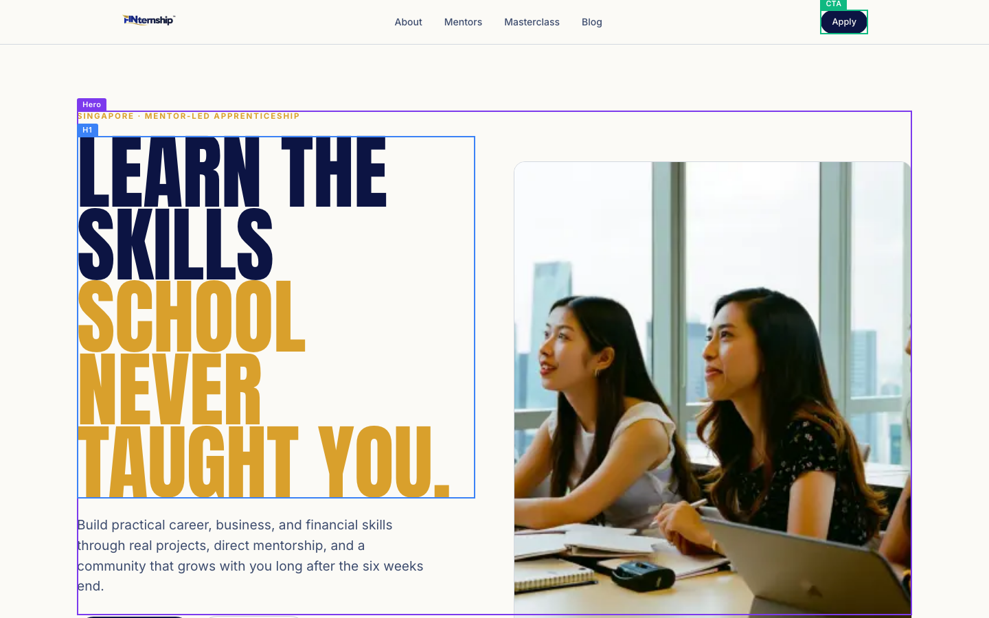
Current: "SINGAPORE · MENTOR-LED APPRENTICESHIP"
Issue: Clear, but it does not yet signal who it is for.
Better:
For Singapore students, NSFs, and early-career starters
Free six-week apprenticeship in Singapore
Practical career and finance training, mentor-led
Current: "LEARN THE SKILLS SCHOOL NEVER TAUGHT YOU."
Issue: Strong idea, but it is broad and familiar. It needs to make the promised identity sharper.
Better:
Become the kind of young professional school did not train you to be.
Build the real-world skills your first role will expect.
Leave school with more than grades. Leave with proof.
Current: "Build practical career, business, and financial skills through real projects, direct mentorship, and a community that grows with you long after the six weeks end."
Issue: Good ingredients, but the sentence carries too many features before the payoff.
Better:
Spend six weeks working on real briefs, getting direct mentor feedback, and building the confidence to speak, think, and work like a professional.
Get the practical foundation most young people only learn after they start work: business judgment, finance fluency, communication, and a network that stays with you.
Turn curiosity into career confidence through live projects, finance training, mentor reviews, and peers who push you to grow.
Current: "Apply Now"
Issue: Clear, but generic.
Better:
Apply for the cohort
Start your application
Join the next cohort
Current: "Read the blog"
Issue: This pulls attention away from the main action without a clear reason.
Better:
See programme stories
Read student stories
Explore the blog
Current: "1,000+ students mentored"
Issue: Strong proof. Keep it close to the hero.
Better:
1,000+ students mentored
Trusted by 1,000+ students
1,000+ young people mentored
Current: "Real client projects"
Issue: Strong, but "client" may overpromise if projects are from businesses rather than paying clients.
Better:
Live Singapore business briefs
Portfolio-ready project work
Real work, not classroom tasks
Current: "Founder-led mentorship"
Issue: Strong if the founder is a meaningful draw, but it needs to imply access.
Better:
Direct founder feedback
Mentorship from real operators
One-to-one mentor reviews
Current: "Free 6-week apprenticeship"
Issue: Strong offer, but "free" can raise suspicion unless paired with expectations.
Better:
Free to attend, serious to complete
Six weeks, no programme fee
Free apprenticeship, real expectations
What you get
Current: "WHAT YOU GET"
Issue: Functional, but not motivating.
Better:
What you leave with
What changes in six weeks
The foundation you build
Current: "PRACTICAL EXPERIENCE FROM DAY ONE."
Issue: Good promise, but it can be more specific to students who lack work experience.
Better:
Start doing the work before your first real job.
Build experience employers can actually discuss with you.
Get out of theory and into real business problems.
Current: "Real Projects"
Issue: Strong, but could carry more outcome.
Better:
Work you can show
Real business briefs
Portfolio-ready projects
Current: "Work on live business briefs and build portfolio-worthy work."
Issue: Strong.
Better:
Work on live Singapore business briefs and leave with projects you can talk about in interviews.
Build proof of how you think, communicate, and solve real business problems.
Create portfolio-ready work from briefs that feel closer to work than school.
Current: "Mentor Reviews"
Issue: Clear, but the value is not the review. It is the correction.
Better:
Feedback that makes you sharper
Direct mentor correction
Know what to improve next
Current: "Receive direct feedback from experienced operators."
Issue: Strong, but "operators" may be vague for students.
Better:
Get direct feedback from people who know what strong work looks like.
Learn what to fix before an employer has to tell you.
Sit with mentors who review your thinking, communication, and execution.
Current: "Career & Finance"
Issue: Accurate, but broad.
Better:
Career sense and money sense
Work skills plus finance fluency
Understand careers and markets
Current: "Learn communication, negotiation, and the fundamentals of finance and markets."
Issue: Strong topics, but it should connect them to confidence and employability.
Better:
Learn how to present, negotiate, read markets, and make better career decisions.
Build the communication and finance basics that help you sound credible early.
Understand money, markets, and people skills before you enter the workplace.
Current: "Cohort Network"
Issue: Familiar phrase. Make the social value clearer.
Better:
Peers who push you
A serious young network
People growing with you
Current: "Build relationships with ambitious peers and mentors."
Issue: Strong, but can be more specific about why it matters after the programme.
Better:
Meet ambitious peers and mentors you can keep learning from after week six.
Build a circle that helps you find ideas, feedback, and future opportunities.
Grow with people who take their careers seriously early.
Why we built it
Current: "WHY WE BUILT IT"
Issue: Clear, but less emotionally specific than the section deserves.
Better:
The problem we kept seeing
Why students need this earlier
Why FINternship exists
Current: "WHY WE BUILT FINTERNSHIP."
Issue: Clear, but it centers the company instead of the student's pain.
Better:
Too many young people start work unprepared.
Grades do not teach you how work really works.
Students need real-world practice before the stakes get high.
Current: "Students graduate without practical skills."
Issue: Strong.
Better:
Students graduate with grades, but not enough practical skill.
Many students leave school before they learn how work gets judged.
Academic success does not always become workplace confidence.
Current: "Many young people feel lost professionally."
Issue: Strong, but could be more vivid.
Better:
Many young people do not know what a good career move looks like.
They are told to be ambitious, but not shown what to do next.
They feel pressure to choose a path before they understand the options.
Current: "Nobody teaches communication, money, or networking."
Issue: Strong, but "nobody" is absolute.
Better:
Communication, money, and networking are rarely taught with enough practice.
The skills that move careers are often left to chance.
Most students are expected to network, present, and manage money without training.
Current: "Most internships are passive and admin-heavy."
Issue: Strong pain point.
Better:
Too many internships teach students how to wait, not how to contribute.
Many first internships are more admin than growth.
Students need responsibility, feedback, and real work earlier.
Current: "Careers and industries are changing quickly."
Issue: True, but generic.
Better:
Early career paths are less predictable than they used to be.
The old route from grades to job security is no longer enough.
Young people need judgment, adaptability, and money sense earlier.
Current: "FINternship exists to give young Singaporeans a practical foundation early - when it still has time to compound."
Issue: Strong idea, but remove the abstract phrasing and make the payoff concrete.
Better:
FINternship gives young Singaporeans the practical foundation to make better career, business, and money decisions earlier.
We help students build real-world confidence before their first role, when the right habits can still compound.
The goal is simple: give young people the skills, feedback, and exposure most only get after years of trial and error.
Career + Finance
Current: "CAREER + FINANCE"
Issue: Clear, but it sounds like two topics rather than one connected advantage.
Better:
Where career sense meets money sense
The two fluencies school missed
Work skills for the finance world
Current: "CAREER SKILLS MEET THE FINANCE INDUSTRY."
Issue: Strong direction, but it does not say what the student becomes.
Better:
Learn to think like a professional in a finance-driven world.
Build career confidence by understanding how finance actually works.
Know how to speak, work, and make sense of money earlier.
Current: "FINternship covers what most schools never get to: the practical link between how careers grow and how the financial world actually works."
Issue: Strong.
Better:
FINternship teaches the link school often misses: how careers are built, how money moves, and how finance shapes real decisions.
You learn the people skills that move careers and the finance basics that make the business world easier to understand.
This is the practical bridge between classroom knowledge, first roles, and the financial industry.
Current: "Wealth management"
Issue: Clear topic, but needs plain-language value.
Better:
How wealth is protected and grown
What wealth managers actually do
Long-term money decisions
Current: "Portfolio management"
Issue: Clear, but abstract for beginners.
Better:
How portfolios are built
Risk, return, and allocation
Why investors diversify
Current: "Investment management"
Issue: Clear, but overlaps with portfolio management.
Better:
How investment decisions are made
What drives investment choices
Reading risk before return
Current: "Markets, stocks, and bonds"
Issue: Strong and concrete.
Better:
Markets, stocks, bonds, and funds
What moves stocks and bonds
How markets really behave
Current: "How financial services works"
Issue: Slight grammar issue.
Better:
How financial services work
Inside the finance industry
Roles and paths in finance
Current: "The kind of foundation school never taught."
Issue: Strong idea, but overused.
Better:
The foundation that makes work, money, and career choices less confusing.
The basics you will wish you had before your first internship.
The early advantage of understanding both people and money.
The Finance Core
Current: "THE FINANCE CORE"
Issue: Clear, but programme-centric.
Better:
Finance without the fog
The money fluency you build
How finance starts making sense
Current: "UNDERSTAND HOW FINANCE REALLY WORKS."
Issue: Strong.
Better:
Understand finance well enough to speak with confidence.
Learn the money language behind markets, portfolios, and careers.
Make finance feel less intimidating and more useful.
Current: "Finance is the core of FINternship. Through real case studies and people in the field, you build genuine fluency in markets, wealth, and how the financial industry actually operates."
Issue: Strong, but "genuine fluency" is a little vague.
Better:
Finance sits at the centre of FINternship. You use real case studies and mentor guidance to understand markets, wealth, portfolios, and the roles inside the industry.
You do not just learn terms. You learn how finance decisions are made, what numbers mean, and where different career paths lead.
By the end, finance should feel less like jargon and more like a world you can explain clearly.
Current: "How markets work"
Issue: Strong.
Better:
What moves markets
Markets in plain language
How prices change
Current: "Stocks, bonds, and funds, and what actually moves them."
Issue: Clear, but the double "and" is clunky.
Better:
Stocks, bonds, funds, and the forces that move them.
What stocks, bonds, and funds are, and why their prices change.
How news, rates, risk, and expectations affect markets.
Current: "Wealth management"
Issue: Clear.
Better:
How wealth is managed
Protecting and growing assets
Long-term client money decisions
Current: "How assets are protected and grown over the long run."
Issue: Strong.
Better:
How advisers help protect, grow, and plan assets over time.
The long-term decisions behind saving, investing, risk, and legacy.
What wealth management means beyond picking investments.
Current: "Portfolio fundamentals"
Issue: Clear.
Better:
How portfolios are built
Risk and return basics
The building blocks of investing
Current: "Asset allocation, diversification, and balancing risk against return."
Issue: Strong.
Better:
How allocation, diversification, risk, and return work together.
Why investors spread risk instead of betting on one outcome.
How portfolios balance growth, safety, and time.
Current: "Investment strategy"
Issue: Clear, but broad.
Better:
Making investment choices
Strategy, risk, and timing
How investors think
Current: "From dollar-cost averaging to reading risk and the role of fintech."
Issue: Good specifics, but the line can be cleaner.
Better:
Dollar-cost averaging, risk signals, and how fintech changes access.
How investors plan entries, manage risk, and use modern finance tools.
Practical strategies beginners can understand before they invest.
Current: "Reading the numbers"
Issue: Strong plain-language heading.
Better:
Read what the numbers say
Make sense of financial figures
Understand the story in the numbers
Current: "The basics of financial analysis, and what the figures really say."
Issue: Strong.
Better:
The basics of financial analysis and what the figures are trying to tell you.
How to read numbers without getting lost in jargon.
What financial figures can reveal about a business or investment.
Current: "Inside the industry"
Issue: Strong.
Better:
Inside financial services
How the industry fits together
Roles, routes, and realities
Current: "How financial services works, and the roles and paths within it."
Issue: Grammar issue.
Better:
How financial services work, and the roles and paths inside the industry.
What different finance roles actually do, and how people get there.
A clearer view of the industry before you choose a path.
Where it leads
Current: "WHERE IT LEADS"
Issue: Strong section idea.
Better:
Where this can take you
Your first step into finance
The path after FINternship
Current: "THE GROUNDWORK BEFORE THE CREDENTIALS."
Issue: Strong positioning, but "credentials" may feel too far away for first-time visitors.
Better:
Build the foundation before you chase the title.
Start with fluency before credentials.
Get the basics right before the career gets serious.
Current: "A finance career is built in steps. FINternship is the first one: the financial literacy and real exposure that everything else stands on."
Issue: Strong, clear role in the journey.
Better:
A finance career is built in steps. FINternship gives you the first one: money fluency, industry exposure, and real work to learn from.
Before credentials and job titles, you need the foundation. FINternship helps you understand finance, practise real work, and see where you might fit.
This is not the finish line. It is the early step that makes the next steps clearer.
Current: "Financial literacy & real exposure"
Issue: Strong.
Better:
Money fluency and real exposure
Finance basics with real work
Understand finance before choosing a path
Current: "YOU ARE HERE"
Issue: Strong.
Better:
Start here
Your first step
Where FINternship fits
Current: "The money fundamentals and hands-on experience. This is where FINternship comes in."
Issue: Clear, but could be more outcome-led.
Better:
Learn the money fundamentals and practise them through real projects. This is where FINternship fits.
Build the early finance confidence and work exposure that make later choices easier.
Get the foundation before internships, first roles, or credentials demand more from you.
Current: "Industry experience & first roles"
Issue: Strong.
Better:
First internships and roles
Putting the skills to work
Your next real opportunity
Current: "Putting it to work in real jobs, internships, or a venture of your own."
Issue: Strong.
Better:
Use the foundation in internships, first jobs, or your own venture.
Turn early practice into better performance when real opportunities arrive.
Bring clearer thinking, communication, and finance sense into your first roles.
Current: "Professional credentials"
Issue: Clear, but can be framed as later, not promised by FINternship.
Better:
Credentials later
Formal qualifications next
Accredited paths after experience
Current: "CFP, ChFC, and other designations, earned later through accredited coursework and experience."
Issue: Responsible and clear.
Better:
CFP, ChFC, and other designations come later through accredited coursework and experience.
When you are ready, formal credentials can build on the foundation you started here.
FINternship is the groundwork. Accredited credentials are a later step.
Honest fit check
Current: "HONEST FIT CHECK"
Issue: Strong. Keep this energy.
Better:
Honest fit check
Read this before applying
Who should apply
Current: "THIS PROGRAMME REWARDS OWNERSHIP."
Issue: Strong, but "ownership" can be abstract for younger readers.
Better:
This is for people who do the work.
You will get more out if you put more in.
Free to attend. Not easy to coast through.
Current: "Free to attend, but built for people willing to put in real effort. Expect direct feedback and real expectations."
Issue: Strong.
Better:
FINternship is free to attend, but it is built for people who show up, take feedback, and finish the work.
There is no programme fee. There are real expectations, real feedback, and real responsibility.
Apply if you want to be stretched, not just certified.
Current: "NOT FOR YOU IF"
Issue: Strong.
Better:
Do not apply if
Not the right fit if
Skip this if you
Current: "Only want something to add to your CV"
Issue: Strong, but could be sharper.
Better:
Only want a line on your CV
Want the badge without the work
Care more about listing it than learning it
Current: "Prefer passive learning over practical work"
Issue: Strong.
Better:
Prefer lectures to doing real work
Want to watch instead of practise
Avoid hands-on project work
Current: "Avoid difficult feedback"
Issue: Strong.
Better:
Avoid honest feedback
Take correction personally
Do not want your work challenged
Current: "Want shortcuts without putting in the reps"
Issue: Strong.
Better:
Want shortcuts without the reps
Expect growth without practice
Look for hacks instead of habits
Current: "GOOD FIT IF"
Issue: Strong.
Better:
Apply if you
Good fit if you
You belong here if you
Current: "Want practical skills with long-term value"
Issue: Strong.
Better:
Want skills that still matter after school
Care about long-term career value
Want practical skills you can keep using
Current: "Care about growth beyond grades alone"
Issue: Strong.
Better:
Know grades are not the whole story
Want growth beyond academic results
Care about becoming capable, not just qualified
Current: "Learn best from people with real experience"
Issue: Strong.
Better:
Learn best from people who have done the work
Want feedback from real operators
Prefer real examples over theory alone
Current: "Stay consistent even when it gets uncomfortable"
Issue: Strong.
Better:
Stay consistent when the work gets uncomfortable
Can take pressure without disappearing
Keep showing up when feedback is hard
From past cohorts
Current: "FROM PAST COHORTS"
Issue: Strong, but testimonials need more specific proof.
Better:
What past participants changed
What students took from it
After six weeks
Current: "WHAT PARTICIPANTS SAY."
Issue: Generic. The page needs proof of transformation, not just praise.
Better:
How participants grew in six weeks.
What changed after real projects and mentor feedback.
The confidence past cohorts built.
Current: "I became more confident speaking and presenting ideas."
Issue: Believable, but too general to carry strong proof. Add a specific before, situation, or result if available.
Better:
[Before FINternship, I struggled to present ideas clearly. By week six, I could present a project recommendation with confidence.]
[The mentor reviews helped me speak more clearly, structure my points, and defend my ideas.]
[I left with more confidence presenting because I had practised it on real briefs, not just slides.]
Current: "This was the first programme where I worked on projects that actually mattered."
Issue: Strongest testimonial idea. Make the project concrete if possible.
Better:
[This was the first programme where my work had a real business brief behind it.]
[I finally worked on projects that felt close to what employers expect, not just school assignments.]
[The live briefs made me take the work more seriously because it actually mattered.]
Current: "The mentor feedback helped me understand what employers actually look for."
Issue: Strong. Add the specific lesson if available.
Better:
[Mentor feedback showed me what employers look for: clearer thinking, stronger communication, and ownership of the work.]
[I learned how my work would be judged outside school, and what I needed to improve.]
[The feedback made interviews and internships feel less mysterious because I knew what good work looked like.]
The roadmap
Current: "THE ROADMAP"
Issue: Clear.
Better:
Your path through FINternship
How the ladder works
Start here, keep growing
Current: "THREE STAGES, ONE TRAJECTORY."
Issue: Stylish, but "trajectory" is abstract.
Better:
Start with the fundamentals. Keep earning harder opportunities.
One six-week start. A longer path if you want it.
From curious beginner to trusted contributor.
Current: "Most people stop at the first taste. FINternship is built as a ladder: start with the fundamentals, then keep climbing as far as you are willing to go."
Issue: Strong, but "first taste" is vague.
Better:
FINternship starts with a six-week foundation. If you keep showing ownership, the path can continue into harder briefs, deeper feedback, and leadership inside the ecosystem.
You start with the basics, then earn the chance to take on more responsibility, better work, and a stronger network.
The first stage builds capability. The next stages reward the people who keep showing up.
Current: "BOOTCAMP"
Issue: Familiar, but not very distinctive.
Better:
Bootcamp: Build the foundation
Stage 01: Become capable
Start here: Six-week foundation
Current: "The foundation. Over six weeks you work live briefs from real Singapore businesses, sit in one-on-one mentor reviews, and build the core career, business, and money skills the rest of your path stands on. This is where you go from curious to capable."
Issue: Strong.
Better:
In six weeks, work on live Singapore business briefs, get one-to-one mentor reviews, and build the career, business, and money skills your next step depends on.
This is where you move from interest to evidence: real briefs, direct feedback, and work you can explain with confidence.
Start here if you want the practical foundation before your first internship, first role, or finance pathway.
Current: "FASTRACK"
Issue: Clear, but benefit is hidden.
Better:
Fastrack: Sharpen your edge
Stage 02: Own harder work
Go deeper: More reps
Current: "For the ones who want more reps. Harder briefs, sharper feedback, and a tighter cohort moving at pace. You stop doing the work and start owning it, and walk away with a portfolio that earns a second look."
Issue: Strong.
Better:
For participants who want more responsibility: harder briefs, sharper feedback, and a cohort that moves faster. Build a portfolio that earns a closer look.
Take on tougher work, get more demanding reviews, and learn to own the outcome instead of just completing the task.
If Bootcamp builds the foundation, Fastrack gives you the reps to become more trusted with real work.
Current: "ACCELERATOR"
Issue: Common label, but acceptable as a stage name.
Better:
Accelerator: Lead and give back
Stage 03: Become trusted
Go further: Lead real projects
Current: "For the committed few. Lead real projects, mentor the cohorts behind you, and stay in the network for good. This is where the skills compound into opportunities, and where the people who go furthest tend to come from."
Issue: Strong, but "for good" can sound vague.
Better:
For the committed few: lead real projects, support newer cohorts, and stay active in the network long after the first six weeks.
This is where capable participants become trusted contributors, mentors, and long-term members of the ecosystem.
Lead more, give feedback to others, and turn your early skills into stronger opportunities over time.
The ecosystem
Current: "THE ECOSYSTEM"
Issue: Generic. Say what surrounds the student.
Better:
What stays after week six
The network around you
Support beyond the cohort
Current: "SUPPORT THAT DOES NOT STOP AT WEEK SIX."
Issue: Strong.
Better:
The cohort ends. The network should not.
Six weeks of training. Years of people, proof, and feedback.
Keep the mentors, network, and work after the programme ends.
Current: "The cohort runs six weeks. The mentorship, the network, and the work you can show keep going for years. You are in the ecosystem for the long run, not the term."
Issue: Strong.
Better:
The six-week cohort is the start. Your mentors, peers, and portfolio work can keep helping you long after the programme ends.
FINternship is built to give you more than a short course: real work, ongoing relationships, and proof you can keep using.
You do not leave with only memories. You leave with people, projects, and a clearer path.
Current: "Live project work"
Issue: Strong.
Better:
Projects you can show
Real briefs, real practice
Work beyond the classroom
Current: "Real briefs from Singapore businesses, and portfolio work that stays yours to show."
Issue: Strong.
Better:
Work on real Singapore business briefs and keep portfolio-ready work you can show later.
Build evidence of how you solve problems, not just a certificate that says you attended.
Leave with project work that gives interviews more substance.
Current: "Mentors who stay"
Issue: Strong, distinctive.
Better:
Mentors who keep showing up
Feedback beyond the classroom
Operators in your corner
Current: "Honest one-on-one feedback from operators who are still building, not lecturing from a slide deck."
Issue: Strong and vivid.
Better:
Get honest one-to-one feedback from people still building, not just teaching from slides.
Learn from operators who review your work directly and tell you what needs to improve.
Hear what strong work looks like from mentors close to the real world.
Current: "Skills school skipped"
Issue: Strong idea, but familiar phrase.
Better:
The work skills school missed
Communication that gets judged
Speak, present, negotiate
Current: "Communication, presenting, and negotiation. The skills that move careers, taught the way no classroom does."
Issue: Strong.
Better:
Practise communication, presenting, and negotiation in the same way careers test them: through real work and feedback.
Build the people skills that decide how your ideas are heard, trusted, and acted on.
Learn how to speak clearly, present your thinking, and handle difficult conversations.
Current: "Financial fluency"
Issue: Strong.
Better:
Money sense for real life
Finance in plain language
Markets without the jargon
Current: "How markets, investing, and the financial world actually work, in plain language."
Issue: Strong.
Better:
Understand markets, investing, and financial services in language you can actually use.
Learn enough finance to ask better questions and make clearer decisions.
Make sense of money, markets, and industry paths before you choose your next step.
Current: "A network for the long run"
Issue: Strong.
Better:
People who grow with you
A network beyond six weeks
Peers and mentors for later
Current: "Ambitious peers and mentors who stay in your corner years after the cohort ends."
Issue: Strong, but only use if true and supported operationally.
Better:
Build relationships with ambitious peers and mentors you can keep learning from after the cohort ends.
Join a circle of students, NSFs, early-career starters, and mentors who take growth seriously.
Meet people who can give feedback, ideas, and support beyond the six weeks.
Current: "Proof you can point to"
Issue: Strong.
Better:
Evidence employers can see
More than a CV line
Work you can discuss
Current: "Portfolio-ready work and a track record you can put in front of any employer."
Issue: Strong, but "any employer" is broad.
Better:
Portfolio-ready work you can discuss in interviews and applications.
A clearer track record than "I attended a programme."
Proof of how you think, communicate, and handle real briefs.
Open cohort
Current: "OPEN COHORT"
Issue: Clear, but could create more urgency if applications are actually open.
Better:
Applications are open
Next cohort now open
Apply for the next cohort
Current: "BUILD SKILLS THAT CONTINUE PAYING OFF YEARS LATER."
Issue: Strong idea, but a bit vague. Name the skills and the future payoff.
Better:
Build the work, money, and communication skills you will use for years.
Start your career with more confidence, clearer thinking, and real proof.
Spend six weeks building skills your first role will expect.
Current: "Join a mentor-led apprenticeship focused on practical business, career, and financial skills."
Issue: Accurate, but it repeats the mechanism instead of closing the emotional gap.
Better:
Apply for a free six-week apprenticeship where you work on real briefs, get mentor feedback, and build the foundation for your next step.
If you want more than grades and a CV line, join a cohort built for real work, finance fluency, and long-term growth.
Get the practical training, feedback, and network most students only find after they start work.
Current: "Apply Now"
Issue: Clear, but generic.
Better:
Apply for the cohort
Start your application
Join the next cohort
Current: "Applications reviewed manually."
Issue: Useful trust signal, but it can also imply delay without explaining why.
Better:
Every application is reviewed by a person.
We review applications manually for fit.
Serious applicants are reviewed carefully.
Navigation and footer CTAs
Current: "Apply"
Issue: Clear, but generic.
Better:
Apply now
Join a cohort
Start application
Current: "About"
Issue: Standard nav label. Strong enough if the page has clear information architecture.
Better:
About
How it works
Programme overview
Current: "Mentors"
Issue: Strong nav label if mentor profiles exist.
Better:
Mentors
Meet mentors
Who guides you
Current: "Masterclass"
Issue: Unclear how this differs from the apprenticeship.
Better:
Masterclasses
Live sessions
Skill sessions
Current: "Blog"
Issue: Standard, but low-conversion unless the content supports trust.
Better:
Blog
Stories
Insights
Current: "Apprenticeship"
Issue: Strong footer label.
Better:
Apprenticeship
Six-week cohort
Programme path
Positioning
FINternship should stand for the practical foundation before the first serious career move. It is not just a free apprenticeship, a finance course, or a mentorship programme.
It should be known as the career-readiness apprenticeship for young Singaporeans who want real work experience, finance fluency, and mentor feedback before their first role.
The three changes to test first
1. `LEARN THE SKILLS SCHOOL NEVER TAUGHT YOU.`
Become the kind of young professional school did not train you to be.
2. `Build practical career, business, and financial skills through real projects, direct mentorship, and a community that grows with you long after the six weeks end.`
Spend six weeks working on real briefs, getting direct mentor feedback, and building the confidence to speak, think, and work like a professional.
3. `Apply Now`
Apply for the cohort