inteGPT
Getting ThereWeighted mean of 11 dimensions from a sourced principles library (NN/g, Baymard, Cialdini, WCAG, Core Web Vitals, Laws of UX).
The Scorecard
What your visitor sees first
The Brutal Truth
You have built a page that looks like it costs money and works like a product that doesn't want yours yet. The design, speed, and pricing clarity all earn trust in the first ten seconds, and then two things quietly hand it back. When a first-time visitor clicks the button you most want them to click, they are greeted with 'Welcome back! Please sign in to continue', a login screen for people who already have accounts, which is the single most expensive moment on the page. The one who pushes past that finds a company they can't verify: no name, no About, no address, and a personal Gmail as the only way to reach you, on a tool asking studios to upload client work and catalogs. There is not one testimonial, logo, or number to say anyone else trusts this. So a designer with a credit card arrives convinced by the craft, hits a returning-user wall, and finds nothing to prove you are real. Fix the sign-up door and show real proof, or the polish keeps drawing people to an entrance that turns them away.
Top 3 Things to Fix Right Now
First Impression & Clarity 7/10 · 14% weight
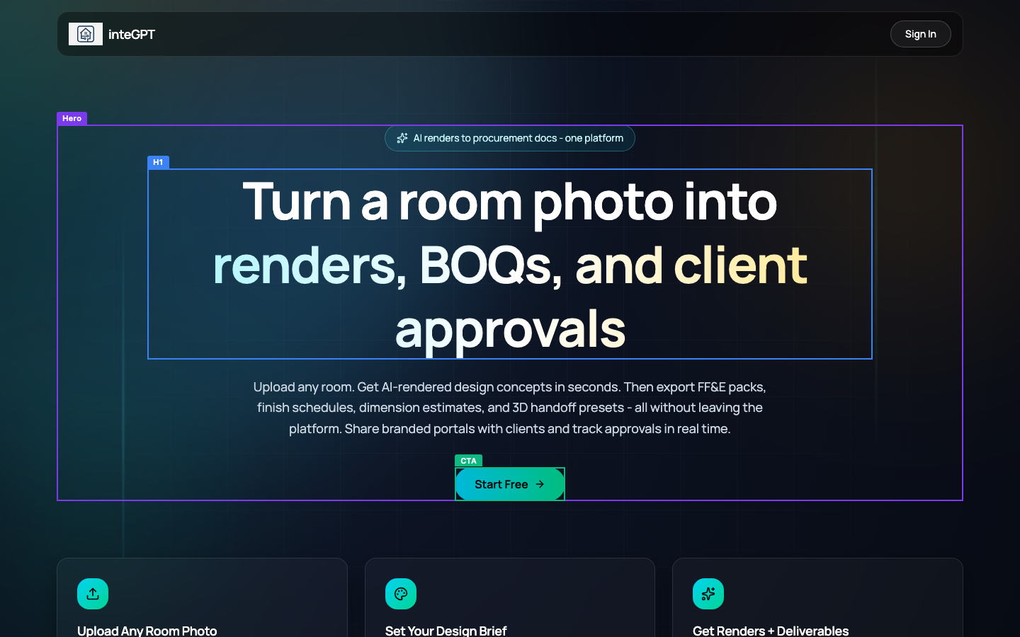
Your above-the-fold view passes the visual snap-judgment cleanly. The dark hero with the teal 'Start Free' button reads as a deliberately designed product, not a template, so aesthetic-usability works in your favor. The H1 'Turn a room photo into renders, BOQs, and client approvals' is customer-centric and names the job-to-be-done, and the subline fills in the specifics. The weak point is jargon-free-hero: 'BOQs' is a bill-of-quantities acronym that a first-time visitor outside the trade will stall on, and it sits in the second line of your headline before any explanation reaches the eye. Message-match also slips. Your browser tab title is just 'inteGPT' and the meta description reads 'Created by inteGPT', which tells a Google searcher nothing about what you do, so the promise on the page never gets set up before the click. There is no stated contrast with the alternative a designer already uses (Photoshop, Midjourney, doing renders by hand), so differentiation is implied by the feature stack rather than claimed. Single primary CTA above the fold is clear and present.
Visual Hierarchy & Layout 8/10 · 11% weight
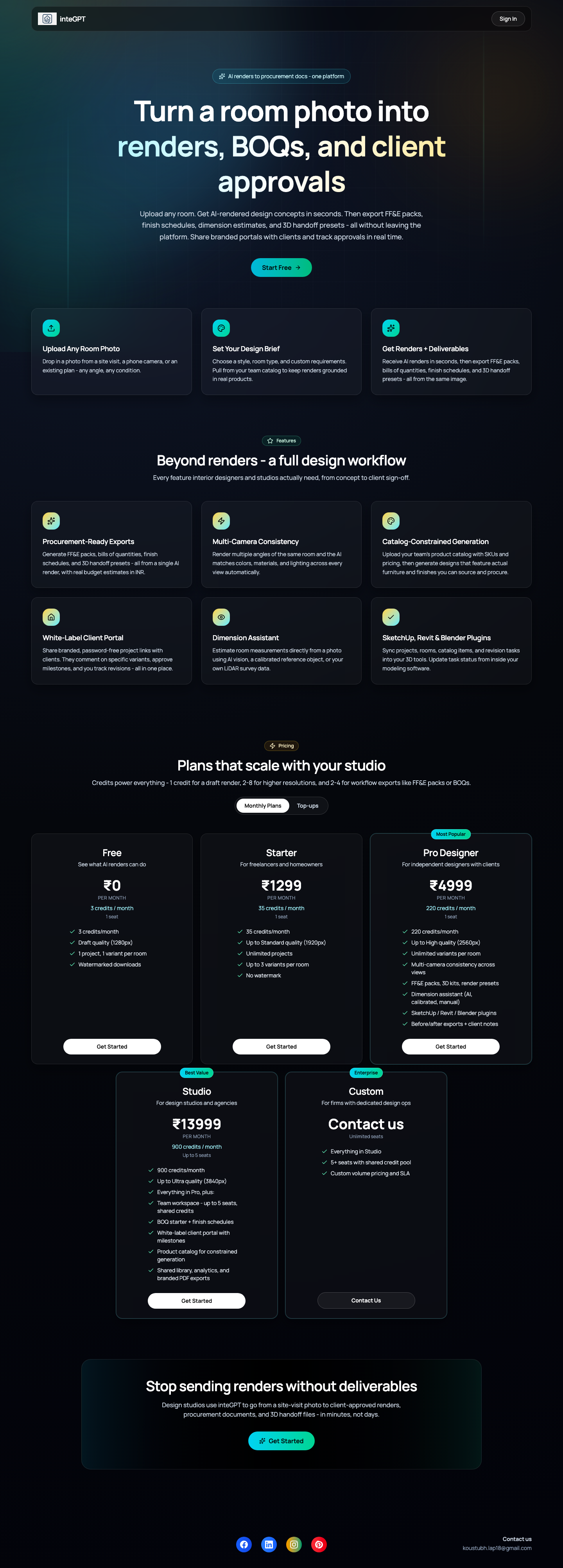
This is the strongest part of the page. The eye lands on the H1 first, then the teal 'Start Free' pill, which is the only saturated element in a restrained dark field, so Von Restorff and the dominant focal point both work. Hierarchy through size and weight is deliberate: a large geometric headline, a lighter grey subline at a clear step down, then uniform three-up feature cards. Whitespace is generous, with real breathing room around the hero and consistent gutters between cards, and nothing crowds the viewport edges. Common-region grouping is handled well by the bordered cards in the 'how it works' row, the feature grid, and the pricing tiles, so a long page still reads as chaptered sections rather than one flat sheet. Alignment holds to a grid down the full page. The one soft spot is the pricing area: the Studio and Custom tiles drop to a two-up row below the first three, which breaks the rhythm of the tier comparison and makes Studio feel visually separated from the plans it should sit beside. Depth is used sparingly but present through card elevation against the dark background.
Typography 8/10 · 7% weight
Type is set with intent. The headline uses a rounded geometric sans with real personality, sized large enough to own the fold, and the accent coloring on 'renders, BOQs' and 'client approvals' adds emphasis through color rather than yet another size. The scale is deliberate and limited: one display size for the H1, a clear step down to the grey subline, consistent card titles, and body copy that holds a comfortable reading size. Body line-height in the feature and pricing cards is adequate, lines don't collide, and paragraphs are left-aligned in the cards where it matters. Families are restrained, effectively one type system used consistently across hero, features, and pricing. Emphasis by weight and color is handled well, with de-emphasized secondary text like 'PER MONTH' set smaller and lighter. The main critique is the centered hero paragraph: the subline is three-plus lines of centered body copy, which is harder to track than left-aligned, and the same centered treatment repeats in section intros. It reads fine at this length but is the one place the typography leans on a convention that works against comfortable reading.
Color & Contrast 7/10 · 7% weight
The palette is disciplined and cohesive: a dark navy-to-teal field, white and off-white text, and a single teal accent reserved for the primary CTA. That reserved action color is the standout win, because the eye finds 'Start Free' and 'Get Started' automatically and no decorative element steals that hue. The CTA contrast is high, teal on dark with dark button text, so it pops as the most eye-catching control in view. Feature icons pick up the teal and lime accents consistently. The risk sits in the grey-on-dark body text. The hero subline and the card descriptions are set in a muted grey that, on the dark background, sits close to the 4.5:1 floor and reads slightly washed out, especially the longest paragraphs. This is the grey-on-color trap in its dark-mode form. The white pricing checkmarks and tier numbers hold contrast well. Nothing relies on color alone for meaning in a way that breaks comprehension, though the accent-colored words in the H1 are decorative rather than semantic. Overall the color system is a strength; the fix is nudging secondary text brighter.
Conversion Path & CTA 5/10 · 14% weight
A single primary action is clear and repeated, and the path looks smooth until you actually click it. When our test visitor clicked 'Start Free', they landed on a page headed 'Sign in to inteGPT' with the line 'Welcome back! Please sign in to continue.' That greets a brand-new visitor as if they already have an account, which is the exact sign-in-wall failure that kills first-time conversions. There is a 'Sign up' link at the bottom of that card, but you have made the new user hunt for it under a returning-user headline. 'Get Started' from the pricing tiles does the same thing. So the CTA copy promises 'Start Free', and the destination's first message is a login for people coming back. Risk reversal near the button is missing too: there is no 'no credit card required' or 'free forever plan' microcopy under 'Start Free', even though a genuine free tier exists further down. Pricing itself is a strength, laid out clearly with credits explained and the CTA repeated at the close. The funnel is well built right up to the door, then the door says the wrong thing to the person you most want to keep.
Trust & Credibility 4/10 · 12% weight
The design does a lot of trust work: professional execution, clean type, disciplined color, and a fast load all say a competent team built this. Then the footer undoes much of it. The only contact on the entire page is 'koustubh.lap18@gmail.com', a personal Gmail address, which for a paid product asking designers to upload their client work and product catalogs reads as a side project rather than a company. There is no About section, no company name beyond the product, no physical address, and no team or expertise signal anywhere. For a tool that wants studios to trust it with procurement documents, that anonymity is a real barrier. Legitimacy signals expected when money and file uploads are involved are absent: no privacy policy link, no terms of service, no security or data-handling reassurance, even though the sign-in is handled by Clerk. HTTPS is in place and the copy is free of typos, so the basics of polish hold. But a stranger with a credit card has almost nothing here to confirm a real, accountable business stands behind the platform, and a Gmail address actively signals the opposite.
Social Proof & Persuasion 4/10 · 10% weight
Persuasion mechanics are half-built. The free tier is a genuine give-first, low-commitment first step, and the audience framing is specific and relatable: 'Every feature interior designers and studios actually need' and the closing 'Design studios use inteGPT to go from a site-visit photo to client-approved renders' speak directly to the reader's world. The close itself is decent, ending on a value restatement with a final CTA rather than trailing off. What's missing is the whole evidence layer. There are no testimonials, no customer names or logos, no counts, no ratings, and no authority markers anywhere on the page. The line 'Design studios use inteGPT' claims social proof without a single studio named, which reads as an assertion rather than evidence. For a new product asking designers to change how they deliver work to clients, that absence of any 'other people like me trust this' signal is the biggest persuasion gap. You don't need to fabricate anything; you need to collect and show real proof, even a handful of early-user quotes with names and studio names would move this materially.
Content & Copy 7/10 · 9% weight
The writing is a strength. It leads with outcomes ('Turn a room photo into renders, BOQs, and client approvals') and uses features as proof beneath benefit-led subheads rather than as the headline. Subheadings carry meaning on their own: 'Procurement-Ready Exports', 'Multi-Camera Consistency', 'White-Label Client Portal' each tell you the point without the body copy. The page is scannable, chunked into short card paragraphs no longer than two or three lines, which respects a skimming reader. Specificity is good where it counts: real resolutions (1280px to 3840px), credit costs ('1 credit for a draft render, 2-8 for higher resolutions'), and INR prices, rather than vague 'powerful' claims. The copy is reader-centric and names the audience directly. Two gaps hold the score back. 'BOQs' and 'FF&E' are trade acronyms used in the hero and features before they are ever spelled out, so a newer designer stalls. And the page answers price well but skips the other buyer objections: there is no FAQ, no comparison to how they work today, and no proof-of-results content, so a skeptic's questions about accuracy and whether the renders are actually usable go unanswered.
Accessibility (conversion-relevant) 6/10 · 5% weight
The essentials are mostly in place but a few gaps carry through to real users. The single image on the page has alt text, the HTML lang is set to English, and link and button labels are descriptive ('Start Free', 'Get Started', 'Contact Us') rather than 'click here'. The heading structure has one clear H1, which is correct. Against that, the automated pass found four interactive controls with no accessible name, meaning a screen-reader user hits unlabeled buttons, likely the icon-only social links in the footer and the pricing period toggle. There is one heading-order skip, jumping straight from the H1 to an H3 without an H2 in between, which breaks the logical outline for assistive tech navigating by heading. On mobile, the 'Sign In' control measures 86 by 38 pixels, below the comfortable 44px target height, so it is a slightly cramped tap. None of these block conversion outright, but the unlabeled controls and the heading skip are quick, cheap fixes that improve both accessibility and the SEO outline at the same time.
Performance & Perceived Speed 9/10 · 5% weight
Speed is a clear strength. The page reached DOM-content-loaded in about 1.17 seconds and full load in roughly 1.47 seconds, well inside the good thresholds, and network idle was hit around three seconds after navigation without dragging to any cap. The above-the-fold hero renders fully with text and the styled CTA present, so the largest contentful element is a lightweight headline rather than a heavy image, which keeps first paint fast. Interactions were responsive: when our test visitor clicked the CTAs, each registered promptly and navigated to the sign-in page rather than stalling or showing a dead click, which satisfies both the responsiveness and prompt-feedback expectations. There is no sign of layout instability in the captures; the above-fold view matches the settled full page with no late banners shoving content around. The hero is text-and-gradient driven with no blocking video or oversized image gating the render. For a single-page marketing site this is close to ideal, and nothing in the timing or interaction evidence points to a performance cost on conversion.
Mobile Experience 8/10 · 6% weight
The mobile build is genuinely responsive, not a shrunken desktop. The layout reflows to a single column, the headline wraps cleanly across four lines, the subline stacks below it, and the 'Start Free' button sits full and tappable underneath, all confirmed with the headline and CTA visible in the first viewport and no horizontal overflow. Text stays legible without pinch-zoom, and the teal CTA keeps its contrast and size on the small screen. Content parity holds: the mobile view carries the same hero, feature cards, pricing, and closing CTA as desktop, so a phone visitor gets the full persuasive case rather than a stripped-down one. Two things keep this from a higher score. The 'Sign In' control in the header measures 86 by 38 pixels, under the comfortable 44px tap height, so it is a slightly tight target in the top corner. And the primary action sits high in the layout with no sticky or repeated bottom CTA, so on a long scroll the button leaves the thumb zone until the next pricing tile comes into view. Both are easy wins on an otherwise solid mobile experience.
What You're Doing Well
- The above-the-fold design reads as a deliberately built product: dark field, one saturated teal CTA, a large geometric headline with a clear focal point that lands the eye in the right order.
- The value proposition is outcome-led and honest about the whole workflow, from 'Turn a room photo into renders' through FF&E packs, BOQs, and a client portal, rather than just selling a pretty picture.
- Pricing is concrete and confidence-building: real INR amounts, credit costs spelled out, resolution tiers, and a genuine free plan as a low-commitment first step.
- The page loads in about 1.5 seconds with a stable layout and CTAs that respond instantly, so speed never gets in the way.
- Feature subheads carry their own meaning ('Procurement-Ready Exports', 'White-Label Client Portal'), and the copy stays specific and scannable throughout.
Technical & Accessibility signals
Load performance
Accessibility quick-checks (desktop)
Mobile tap targets (375x812)
Deterministic signals measured in-browser at capture time, not model output.
What your visitor actually saw
Make the changes above, then run coldeye on the new version. It reads the old and new side by side, blind, twice with the positions swapped, and tells you which one actually converts better. A score on its own drifts about half a point between runs, so the blind verdict is the part to trust.
Re-audit my page free