SearchBlueprint: SEO + AI-search strategy in one platform
Getting ThereWeighted mean of 11 dimensions from a sourced principles library (NN/g, Baymard, Cialdini, WCAG, Core Web Vitals, Laws of UX).
The Scorecard
What your visitor sees first
The Brutal Truth
Your page looks like a real product and behaves like one, but it asks a stranger to trust a business that gives almost no evidence it exists beyond one person. The design is polished and the funnel is competent, yet the proof layer is empty: no customer has vouched for you, no team is named behind the 'working SEO agency' claim, and the only way to reach you is a personal gmail address sitting in the footer of a platform that charges up to $799 a month. A buyer with a credit card reads that combination as a solo side project, no matter how good the interface looks, and quietly leaves to use a tool other people already trust. Your honesty about the missing logos is admirable, but honesty is not proof. Until you collect a handful of named results from real early users and put a real company identity and contact behind the product, the polish is working to sell something the visitor has no external reason to believe in. That gap between how finished it looks and how unproven it feels is what loses the sale.
Top 3 Things to Fix Right Now
First Impression & Clarity 7/10 · 14% weight
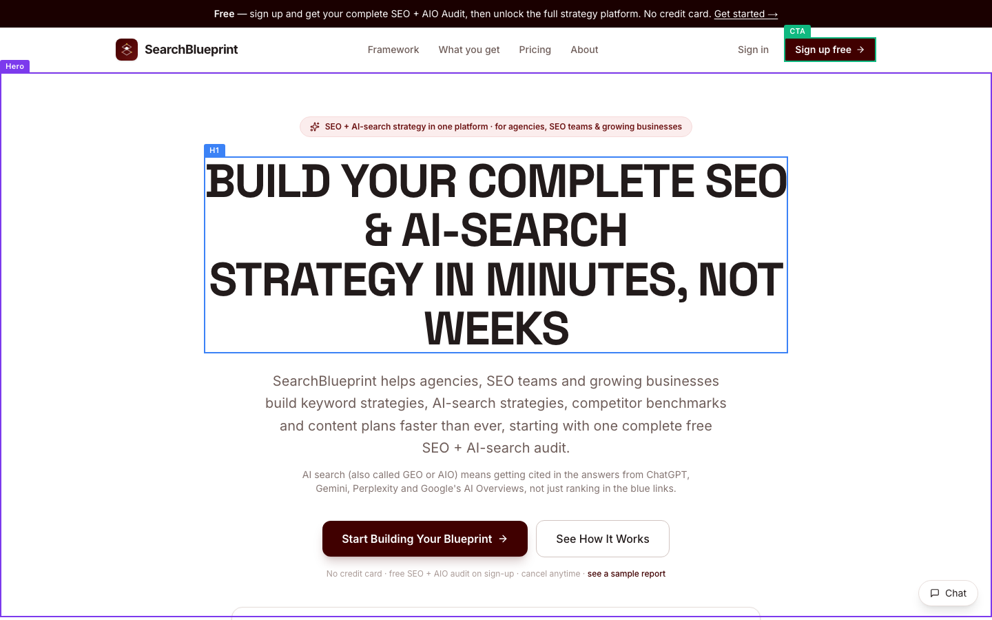
Your above-the-fold view passes the visual snap-judgment cleanly. The maroon-on-cream palette, the oversized condensed headline, and the disciplined spacing read as deliberately designed, not templated, which earns trust before a word is read (aesthetic-usability). The H1 'BUILD YOUR COMPLETE SEO & AI-SEARCH STRATEGY IN MINUTES, NOT WEEKS' names a real outcome and speed, and a styled primary CTA sits right where the eye lands. Where you lose points is the five-second test colliding with jargon and stacking. The pill badge, the H1, and the subline each make a separate claim, so nothing wins as the single strongest promise (single-claim-per-moment fails). The subline opens 'SearchBlueprint helps agencies...', which is company-centric rather than starting from the visitor's problem (value-prop-customer-centric weak). A cold visitor also meets 'AI-search', 'AIO', and 'GEO' fast; you do explain them one line down, but the hero still assumes the reader cares about the category. Differentiation is real: one platform for both traditional SEO and AI-search visibility is a clear contrast to a plain audit tool.
Visual Hierarchy & Layout 8/10 · 11% weight
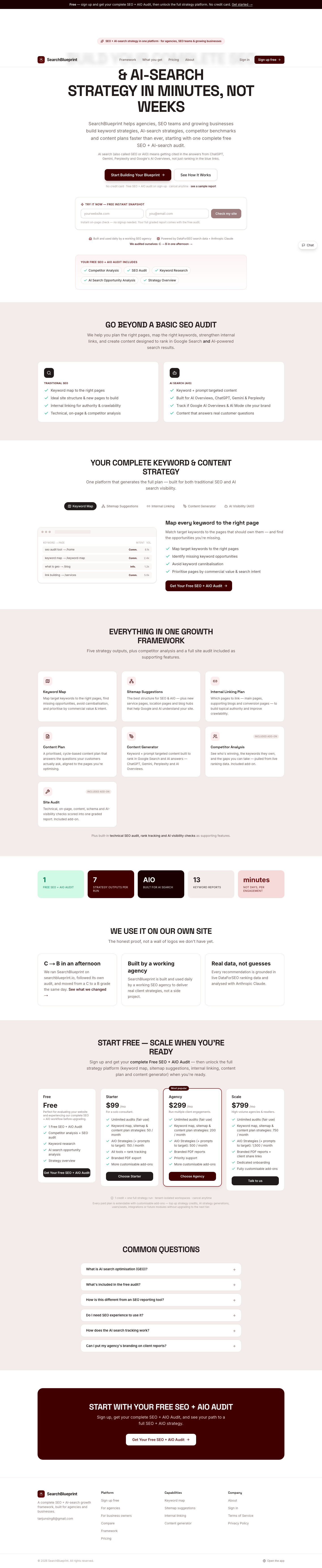
This is the page's strongest dimension. The huge condensed H1 wins the visual-weight contest instantly, so the eye lands on the value prop first (dominant-focal-point passes). Ranking by size, weight, and color is deliberate: display headline, medium grey subline, small muted trust line, then a solid maroon button that is the one loud control. Whitespace is generous, and the full page is chaptered into clear common-region bands, alternating cream and white, with content organized into consistent cards for the framework, pricing, and FAQ. Proximity grouping is clean: each feature card keeps its icon, title, and description together. Alignment holds to a center axis above the fold and a tidy grid below. Two smaller issues keep this off a 9. First, the all-caps section headers repeat so often ('GO BEYOND A BASIC SEO AUDIT', 'EVERYTHING IN ONE GROWTH FRAMEWORK', 'WE USE IT ON OUR OWN SITE') that emphasis flattens; when every header shouts, none leads. Second, the hero stacks the badge, H1, subline, a glossary line, two buttons, and a reassurance line before the fold ends, which crowds an otherwise breathable composition.
Typography 6/10 · 7% weight
Body typography is set for reading: paragraph copy in the hero and feature cards sits comfortably above 16px with relaxed line height, and the type scale has clear steps between the display H1, section headers, card titles, and body. You keep to a restrained pair of families, so there is no clash. The problems are stylistic and hurt more than they look. The hero paragraph and its sub-line are centered across several lines, and centered multi-line body copy is harder to track than left-aligned text (body-left-aligned fails). Everything structural is set in all-caps, which slows reading because word shapes disappear; that is fine for one hero line but you apply it to every section header down the page. The grey hero subline and the even-lighter grey glossary line ('AI search (also called GEO or AIO)...') sit at a weight and tint that read as de-emphasized to the point of straining. Emphasis by weight and color is used well in the nav and buttons, so the toolkit is there; it just needs to stop leaning on caps and centering for body-length text.
Color & Contrast 6/10 · 7% weight
The palette is cohesive and disciplined: a deep maroon accent, warm cream bands, and near-black text form one clear system, and the maroon is reserved for the primary action so the eye can find the next step (semantic-action-color and cohesive-limited-palette pass). The primary CTA pops strongly against the white hero. Where you lose points is grey text. The hero subline is a mid-grey that is already borderline, and the GEO/AIO glossary line below it is lighter still, so it reads as washed out against white and likely misses the 4.5:1 floor for body text. Inside the framework cards, the descriptive copy also sits in a soft grey on cream that strains at a glance. This is the classic move of graying secondary text to signal hierarchy; the cost is that the copy explaining your least-familiar concept (AI-search, AIO) is the hardest to read. The secondary 'See How It Works' button is a low-contrast ghost outline, which is intentional demotion and acceptable, but confirm its border clears 3:1 so it does not vanish.
Conversion Path & CTA 7/10 · 14% weight
The path is mostly well built. Pricing is fully exposed in four tiers ($0, $99, $299, $799), risk reversal sits right under the hero buttons ('No credit card, free SEO + AIO audit on sign-up, cancel anytime'), and the primary action repeats at the framework section, after pricing, and in a closing band, so a convinced reader never scrolls back. When our test visitor clicked 'Start Building Your Blueprint' and 'Sign up free', both landed on a 'Create your workspace' page that leads with 'NO ACCOUNT NEEDED, Explore the live demo' in one click, so you avoid the classic sign-in-wall dead end and offer a genuine low-friction yes. Two things cost you. Above the fold you run two competing buttons of near-equal prominence, splitting the single primary action. And the create-workspace form still asks for email and password with no progress cue, right beside the friendlier demo button, so the visitor faces two different commitments at once. The 'Check my site' instant snapshot is a smart micro-yes that asks for nothing, and you should make that the hero's headline action.
Trust & Credibility 6/10 · 12% weight
You handle the missing-proof problem with unusual honesty, and that helps. The 'WE USE IT ON OUR OWN SITE' band states 'The honest proof, not a wall of logos we don't have yet' and tells a specific, checkable story: 'We ran SearchBlueprint on searchblueprint.io, followed its own audit, and moved from a C to a B grade the same day.' Naming your data sources, 'Powered by DataForSEO search data + Anthropic Claude', adds verifiable grounding. The site is on HTTPS, carries a 2026 copyright, and links Terms and Privacy in the footer, so basic legitimacy signals are present. The credibility hole is contactability and organizational identity. The only contact shown in the footer is a personal address, tanjunsing8@gmail.com, with no company address and no named team behind 'a working SEO agency'. A stranger with a credit card reads a gmail address on a paid B2B platform as a solo side project, which directly undercuts the 'built by a working agency' claim you are making one section up. The visual craft is professional throughout, which buys back some trust, but the anonymity and free-mail contact are the weak seam.
Social Proof & Persuasion 5/10 · 10% weight
Persuasion mechanics are present but the evidence layer is thin, which caps this dimension. Reciprocity is your strongest lever: a complete free SEO + AIO audit and a no-signup 'Check my site' snapshot both give real value before asking for anything, and the 'Explore the live demo' path is a genuine low-commitment first yes. Audience framing is specific and relatable, 'for agencies, SEO teams and growing businesses', so the reader knows who this is for. The gap is social proof: there are no testimonials, no customer counts, no recognizable logos, and no ratings anywhere on the page. You chose to be honest about it rather than fake it, and 'The honest proof, not a wall of logos we don't have yet' plus the self-audit story is the right ethical move, but a stranger still has zero evidence that anyone other than you uses this. The close is solid, a 'START WITH YOUR FREE SEO + AIO AUDIT' band restates the value and repeats the CTA, satisfying the peak-end rule. To move this score you need to start collecting proof from real early users, even a handful of named quotes.
Content & Copy 7/10 · 9% weight
The copy is competent and well structured for a skimmer. Section subheads are descriptive and carry meaning on their own ('Map every keyword to the right page', 'GO BEYOND A BASIC SEO AUDIT'), the page chunks into short cards and bulleted lists rather than walls of text, and the FAQ pre-empts real buyer questions: what is GEO, what the free audit includes, how it differs from a reporting tool, whether SEO experience is needed. Pricing and limits are spelled out per tier. Two weaknesses hold it back. The hero opens self-referentially, 'SearchBlueprint helps agencies...', describing the tool rather than starting from the reader's problem or result, which is the reader-centric principle you most want to nail at the top. And jargon density is high for a cold visitor: 'AI-search', 'AIO', 'GEO', 'cannibalisation', and 'topical authority' arrive fast. You do define GEO and AIO, which is to your credit, but the hero still assumes the reader already values the category. The benefit-led instinct is there ('IN MINUTES, NOT WEEKS'), so tightening the opening line from 'we help' to 'you get' would lift this quickly.
Accessibility (conversion-relevant) 7/10 · 5% weight
The structural accessibility signals are clean. The page declares its language, uses exactly one H1, and the heading order nests without skipped levels, so the outline is logical for screen readers and skimmers alike. Link and button text is descriptive out of context, 'Get Your Free SEO + AIO Audit', 'See what we changed', 'Choose Starter', with no bare 'click here' or 'read more' as a primary action. Because the hero and feature sections use styled type and icons rather than photographs, there are no informative images missing alt text to flag. Two things keep this from scoring higher. On mobile, several tap targets come back undersized: 'Sign up free' at 36px tall and the 'Chat' launcher at 38px both sit below the comfortable 44px, and three of four checked controls were flagged small. Second, the faded grey secondary text noted under color contrast is an accessibility issue as much as an aesthetic one, since low-contrast body copy fails readers with low vision. Focus-state visibility was not directly captured here, so treat that as unverified rather than passing.
Performance & Perceived Speed 8/10 · 5% weight
Speed is a genuine strength and it is not costing you anything. The main content reached DOM-ready and load at about 1.6 seconds, well inside the 2.5-second good threshold for main-content render, and network idle was reached quickly rather than dragging to a timeout cap. The above-the-fold capture shows the hero fully rendered, headline, subline, buttons, and badge all present, with no blank placeholders or half-painted state, which points to good perceived performance. There is no evidence of layout instability: the settled full-page view matches the above-fold composition, with no sign of banners or images shoving content around as they load. Interactions were responsive too. When our test visitor clicked the primary buttons, each registered promptly and navigated to the workspace page without stalling or showing a dead 'no visible change', and the in-page 'See How It Works' scroll resolved cleanly. Since the hero is type-driven rather than gated by a heavy hero image or video, first render is not blocked by unoptimized media. The only reason this is not a 9 is the absence of a real Core Web Vitals measurement to confirm LCP and CLS precisely.
Mobile Experience 7/10 · 6% weight
The mobile build is real, not a shrunk desktop page. At 375px the layout reflows to a single column, the headline stacks and stays readable, and the captured check confirms no horizontal overflow, with both the H1 and a primary CTA visible in the first viewport. Body text remains legible without pinch-zoom, and the persuasive content, framework cards, pricing, and FAQ, is preserved rather than stripped, so mobile visitors get the full case. The weak spots are touch ergonomics. Several tap targets come back below the comfortable 44px: 'Sign up free' at 36px tall and the 'Chat' launcher at 38px, with three of four checked controls flagged small, so thumbs will occasionally miss. The primary action in the first mobile view lives in the top bar ('Sign up free'), which is out of the natural thumb zone; there is no sticky or repeated bottom CTA to catch a reader mid-scroll, so a convinced visitor near the pricing section has to reach back up or hunt for the next button. Adding a persistent bottom-bar CTA on mobile would fix both the reach and the target-size gap in one move.
What You're Doing Well
- The above-the-fold design reads as deliberately crafted, not templated: a confident condensed headline, a single reserved maroon action color, and generous whitespace that buys trust before a word is read.
- You are honest about not having proof yet, and the self-audit story ('C to a B grade the same day' on your own site, powered by named DataForSEO and Anthropic data) is specific and checkable rather than a fabricated logo wall.
- The conversion path is well instrumented: pricing is fully exposed across four tiers, risk reversal sits under the hero, the CTA repeats at every decision point, and the primary button leads to a real one-click demo instead of a sign-in wall.
- Speed is genuinely good, with main content rendered in about 1.6 seconds and no layout instability or dead clicks.
- The FAQ pre-empts the real buyer objections, from what GEO means to how this differs from a reporting tool and whether SEO experience is needed.
Technical & Accessibility signals
Load performance
Accessibility quick-checks (desktop)
Mobile tap targets (375x812)
Sign up free (134x36px)
Chat (87x38px)
Deterministic signals measured in-browser at capture time, not model output.
What your visitor actually saw
Make the changes above, then run coldeye on the new version. It reads the old and new side by side, blind, twice with the positions swapped, and tells you which one actually converts better. A score on its own drifts about half a point between runs, so the blind verdict is the part to trust.
Re-audit my page free