MoneyBees, Financial Planning for Young Adults | SG
Getting ThereWeighted mean of 11 dimensions from a sourced principles library (NN/g, Baymard, Cialdini, WCAG, Core Web Vitals, Laws of UX).
The Scorecard
What your visitor sees first
The Brutal Truth
Your page is built and written like a company that deserves trust, but it never proves it is one, and in Singaporean financial advice proof of a licensed firm is the whole game. A careful young adult about to hand you their CPF and insurance details looks for the things every regulated advisor shows: a licensed entity, a MAS or representative number, a named advisor, a phone number, an office. None of it is here. Then the one trust signal you do offer works against you, because the same two testimonials repeat five times each, which reads as padding and makes even the genuine quotes look invented. So the visitor who is impressed by your clarity and your free tools arrives at the trust question, finds an anonymous firm behind polished copy, and closes the tab. Everything else is strong enough that this is fixable in a week: name the licensed entity, publish real contact details, and show each testimonial once. Until then, good design is quietly converting your credibility into suspicion.
Top 3 Things to Fix Right Now
First Impression & Clarity 7/10 · 14% weight
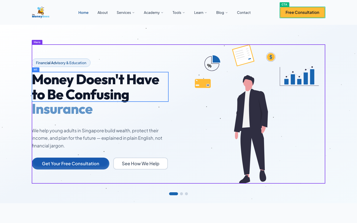
The hero passes the 5-second test better than most. Your H1 "Money Doesn't Have to Be Confusing" is emotional rather than descriptive on its own, but the badge "Financial Advisory & Education" and the subline "We help young adults in Singapore build wealth, protect their income, and plan for the future" together tell a stranger exactly what is sold and for whom. That satisfies clarity and the customer-centric value proposition. Visual craft is genuinely good: balanced two-column layout, a custom bee mark, disciplined blue-and-yellow palette, and a clear primary CTA "Get Your Free Consultation" that wins the eye. Jakob's Law conventions are all in place. The weak spot is the lone rotating word "Insurance" sitting under the H1 with nothing around it, which reads as a half-finished animation frame to a first-time viewer and briefly muddies the single-claim moment. Differentiation is thin at the fold: "plain English, not financial jargon" is the only contrast with the incumbent advisor, and every advisor says that. You look credible and clear, just not yet distinct.
Visual Hierarchy & Layout 8/10 · 11% weight
This is the strongest dimension. The above-fold view has one clear focal contest and the H1 plus the solid blue CTA win it, helped by generous whitespace on the left column and a supporting illustration on the right that points inward rather than competing. Down the page you use common-region cards for the six services, a tinted band for "Why choose us?", a numbered three-step row, and a dark testimonial section, so a long page stays chaptered instead of running as one flat sheet. Spacing rhythm is consistent between sections and alignment holds to a grid. Similarity is mostly respected: service cards share one style, step markers share one style. Two things hold it back from a 9. The primary action appears in two different colors (a yellow "Free Consultation" button in the nav and a blue "Get Your Free Consultation" in the hero), which breaks similarity for the single most important role on the page. And the floating hero icons (pie chart, credit card, coin, bar chart) add mild visual noise around the illustration without carrying meaning.
Typography 7/10 · 7% weight
Type is set with intent. The display face on the H1 is heavy and characterful, body copy looks comfortably above 16px, and there is a clear step from H1 to section H2s to card H3s to body, so the scale reads as deliberate rather than accidental. Line height in the paragraphs is relaxed and lines track easily. You keep to essentially two families (a rounded display for headings, a clean sans for body), which respects the restraint principle. Emphasis mostly comes from weight and size rather than shouting everything. Two smaller issues keep this off a higher score. The service-card body copy runs fairly long per line inside its column and pairs with a slightly grey tone, which nudges it toward the low-contrast, harder-to-scan end. And the hero subline is set in a mid-grey that, while readable, is softer than the crisp near-black of the headline. Nothing here is broken; it is a competent, professional type system with a couple of contrast-and-measure refinements left on the table.
Color & Contrast 7/10 · 7% weight
The palette is cohesive and disciplined: navy, a mid-blue, one warm yellow accent, and neutral greys. That restraint is exactly right and the page never becomes a color zoo. The primary blue CTA "Get Your Free Consultation" pops strongly against the pale hero and is easy to find. The dark testimonial band keeps its text light enough to read, avoiding the grey-on-dark trap in the places I could check. Where you lose points is the reserved-action-color principle. The accent color is doing two jobs at once: yellow marks the nav "Free Consultation" button, but yellow is also the logo and appears on decorative hero icons, while the actual hero CTA is blue. So the eye cannot learn one color that always means "act." Secondary grey body text on white also sits on the softer side of comfortable. Neither is a failure of legibility, but the split action color is a real friction cost: a first-time visitor scanning for "where do I click" gets two competing color signals for the same destination.
Conversion Path & CTA 8/10 · 14% weight
The path works, which is the thing most pages fail. When our test visitor clicked "Free Consultation," it went straight to /contact and a clean form: Name and Email required, Phone optional, a service dropdown, and a message box. That is honest message match and a low-friction ask, not a sign-in wall or a dead button. The primary label leads with value ("Get Your Free Consultation"), the action repeats at the bottom ("Book Free Consultation"), and risk reversal is explicit in copy like "zero commitment, zero pressure" and "free, no-obligation." All strong. Two things cost you. The single-primary-action principle is muddied at the fold because the same action wears two colors (yellow nav, blue hero), splitting attention rather than concentrating it. And there is no privacy or data reassurance sitting next to the form fields themselves, only a "I agree to the privacy policy" checkbox, so the moment of handing over a phone number carries no reassurance about what happens next. Fix those and this is a genuinely well-built funnel.
Trust & Credibility 4/10 · 12% weight
This is where a stranger with a credit card hesitates, and for a regulated category it is the dimension that matters most. You are offering financial advice to young Singaporeans, yet nothing on the page shows a licensed, contactable firm. There is no MAS licensing or financial adviser representative details, no company registration or UEN, no physical address, and no phone or email. The only way to reach a human is the contact form. For an industry where visitors are trained to check credentials before trusting anyone with their CPF and insurance, that absence is disqualifying. Compounding it, the testimonials are duplicated verbatim: "Rachel Lim, Recent Graduate" and "David Ong, Small Business Owner" repeat five times each in the same block. To a careful reader that looks careless at best and fabricated at worst, and it quietly poisons every other quote on the page. On the credit side, the footer carries privacy, terms and disclaimer links, HTTPS is present, and dated 2026 blog posts show the site is maintained. But polish and freshness cannot substitute for proof that a real, licensed organization stands behind the advice.
Social Proof & Persuasion 6/10 · 10% weight
The persuasion architecture is well thought out, then undercut by execution. Reciprocity is genuinely strong: before asking for anything you offer a free eBook ("The Ultimate Guide to Adulting: Finance Edition"), a free Telegram community, live calculators, and a full library of guides. The low-commitment first step is clear (a free, no-strings consultation), and liking is handled well because the copy speaks directly to career starters, NSFs, and young families in their own language. The closing section restates value and gives a final CTA, satisfying peak-end. What drags the score down is the proof itself. The testimonials are named and role-tagged, which is good, but they are duplicated five times each, so the wall of proof is mostly the same two people repeated. There are no client counts, no recognizable partner or media logos, and no authority markers like MAS licensing or press mentions, only "2,000+ subscribers" on the newsletter. Real, de-duplicated testimonials plus one authority signal would move this dimension fast.
Content & Copy 8/10 · 9% weight
The writing is a real strength. It leads with outcomes, not mechanisms: service blurbs promise "walk in with a guess and walk out with a number" and "from zero to your first portfolio," which is benefit-led and concrete. The voice is consistent, plain-spoken, and clearly aimed at young Singaporeans, using local specifics like CPF LIFE, TDSR, MSR, BTO and Integrated Shield that prove you know the audience's actual world. Structure serves a skimmer well: descriptive subheads, short chunks, and bulleted proof points under each service. Crucially for a buyer, the page answers objections head-on with an eight-question FAQ covering cost of the first consult, how you differ, confidentiality, and switching advisors. That is the objection-handling most pages skip. The one weakness is specificity of results. The copy is rich on process but light on numbers that prove it works: no "X clients," no average savings or outcome figures, and differentiation still leans on soft phrases like "plain English." Tightening a few claims with real numbers would take good copy to excellent.
Accessibility (conversion-relevant) 6/10 · 5% weight
The essentials are mixed. Heading structure has a real defect: the page ships two H1s, "Money Doesn't Have to Be Confusing" and the rotating word "Insurance," where there should be exactly one. That confuses screen-reader document outline and is an easy fix. Otherwise the heading nesting is sensible, moving H1 to H2 section titles to H3 card titles without wild skips. On the contact form, labels are visible and persistent ("Name *", "Email *", "Phone") with placeholders used as hints rather than as the only label, which is the correct pattern. Link and button text is descriptive and makes sense out of context: "Get Your Free Consultation," "Download Free eBook," "View All Articles," with no bare "click here." Text is legible at a comfortable size on both desktop and mobile. What I cannot verify from the capture is focus-visible styling and image alt text, so those are unassessed rather than failed. The dominant issue costing you is the duplicate H1; fixing it also cleans up the odd floating hero word.
Performance & Perceived Speed 8/10 · 5% weight
Nothing here is costing you conversions. The load timeline shows the DOM ready about half a second after navigation and network idle reached at roughly 2.1 seconds, comfortably inside the 2.5-second target for main-content render, and the above-fold capture shows a fully painted hero with headline, illustration and CTA rather than placeholders. That points to a healthy largest-contentful-paint proxy and good perceived performance. Interaction responsiveness looks solid too: when our test visitor clicked the CTAs, each one navigated promptly to a real page (/contact, /learn) with no stalls, dead clicks, or "no visible change" results, which is the signal that clicks are registering and feedback is immediate. The hero art is lightweight vector illustration rather than a heavy hero video or large photo, so first render is not gated by a big asset. I see no evidence of layout shift in the settled full-page view. Without a wired performance probe I am inferring from timing and render evidence rather than measured Core Web Vitals, but every available signal is in the good band.
Mobile Experience 8/10 · 6% weight
The phone experience is well handled. The viewport check reports no horizontal overflow, and the mobile capture confirms it: the layout is a true reflow, not a shrunken desktop page. The badge, headline "Money Doesn't Have to Be Confusing," rotating subline, supporting paragraph, and both CTAs all stack cleanly and fit the 375px width. Both the H1 and the primary CTA are visible in the first mobile viewport, so a phone visitor sees the value prop and the way to act without scrolling. The blue "Get Your Free Consultation" button is full-width and comfortably tall, an easy thumb target, with "See How We Help" stacked beneath it. Body text is legible without pinch-zoom. Content parity holds too; the persuasive case, services, testimonials and CTA all carry through to mobile rather than being stripped. The only refinement worth noting is that the primary action sits in the upper-middle of the screen with no sticky or repeated bottom CTA, so a reader deep in the page must scroll to act. A persistent bottom "Book consult" bar would put the action permanently in the thumb zone.
What You're Doing Well
- The funnel actually works: clicking "Free Consultation" lands on a clean /contact form that asks only for name, email, an optional phone and a message, with "we'll get back to you within 24 hours" and no sign-in wall.
- Reciprocity is strong. You give a free eBook, a free Telegram community, live calculators and a full guides library before asking for anything.
- The copy is benefit-led and speaks the audience's language, using CPF LIFE, TDSR, BTO and Integrated Shield, and an eight-question FAQ pre-empts the buyer's real objections about fees and confidentiality.
- Visual craft is genuinely professional: a disciplined navy-blue-yellow palette, custom bee mark, chaptered card sections, and a clean mobile reflow with no overflow.
What your visitor actually saw

Make the changes above, then run coldeye on the new version. It reads the old and new side by side, blind, twice with the positions swapped, and tells you which one actually converts better. A score on its own drifts about half a point between runs, so the blind verdict is the part to trust.
Re-audit my page free